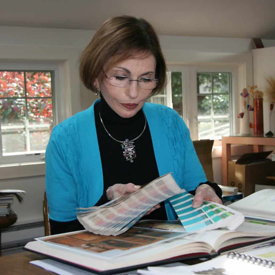
A few weeks ago I interviewed Leatrice Eiseman, colour expert and executive director of the Pantone Colour Institute, for INSIDE, the monthly newsletter produced by WAN Interiors. I asked her all about her prediction for colour of the year 2011, her advice on how best to use this new hue and how she goes about deciding which colour will be crowned ‘Colour of the Year’.

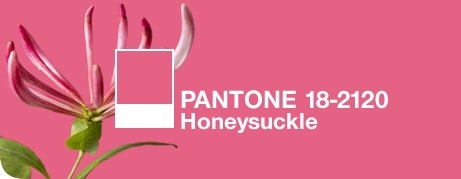
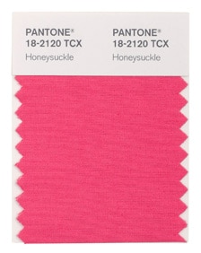
Every year, Pantone, the global authority on colour and provider of professional colour standards for the design industries, announces its Colour of the Year. Last year, PANTONE 15-5519 Turquoise carried the colour crown and served as an escape for many, but according to the experts over at Pantone, 2011 is all about PANTONE 18-2120 Honeysuckle, a vibrant, energetic and festive shade of pink. This brave, bold and confident colour is stimulating and uplifting, encouraging us to face our problems head on with verve and vigour. Leatrice Eiseman is an internationally renowned colour expert and in her role as executive director of the Pantone Colour Institute, she is one of those tasked with the job of determining the Colour of the Year. Here, she gives us an insight into Pantone’s most recent prediction and gives her advice on how to best use this trendy hue in interiors.
Q. How do you go about deciding which colour will be your Colour of the Year each year and how far in advance does this work start?
We start looking at influences in the preceding September. We question people about their hopes, aspirations and concerns for the future. We look at fashion, films in production, buzzwords, art collections for the future, socio-economic issues, we conduct studies, and we look at other studies and surveys. Because we construct a long-term forecast, we know well ahead of time where colours will be going. I also travel extensively internationally, delivering presentations at various shows and I get much of my information from that.
Q. In what ways do your announcements influence the interior design scene and the work of interior designers?
Many interior designers and product designers watch our forecasts for inspiration and direction.
Q. Why is it important to make these announcements annually? Why can the same colour not be colour of the year for two or three years running?
If you have the same colour, there is no sense of newness and many people get bored or disinterested if nothing new catches their eye. There needs to be something ‘fresh’ in the marketplace to keep the consumer’s interest. They might not opt to use the ‘new’ colour, but it still attracts attention.
Q. How can interior designers, architects and manufacturers of interior products get the most out of your annual colour announcements?
Mostly by seeing how the colours are combined. If a client already has gray, for example, a different kind of combination than what they have used before is seen as interesting and enables them to continue to use colours from another year.
Q. How important is it in interior design to choose colours that are appropriate for the tasks that will be carried out in a given location?
Very important. Colour is always a matter of context: how and where it might be used. If a trend colour is inappropriate for a specific space or location or the client simply does not like the colour, then it should not be used.
Q. You recently announced that the Colour of the Year for 2011 is Honeysuckle Pink. What are the main characteristics of this colour?
It is uplifting, dynamic and engages the other senses of scent and taste.
Q. What areas or rooms in the home are best suited for the use of Honeysuckle Pink and what are your suggestions for using this colour successfully in the home?
I think that depends on the client. If they are more open to colour, it can be used in any room and it doesn’t have to be just in minor touches. Everyone today knows that a painted wall is often the easiest to create and can be changed quickly when they tire of it. And it is one of the least expensive things to do.
Q. How would you suggest using Honeysuckle Pink in a commercial setting?
Again, this depends on the context. If the industry or setting is for a ‘glamour industry’ like cosmetics, or for a salon, it can be used more extensively. Likewise in hotels, in food service and certainly for children in hospital settings. But touches can also be used in art work, pillows, patterns, art or carpet design and in many other settings.


