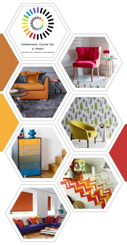
I had absolutely no idea that there was such a thing as International Colour Day until I received a press release from AkzoNobel containing tips for bringing more colour into your life. This seems to be a real big trend at the moment and one that the interiors industry is embracing with open arms. Valspar Paint recently launched in the UK with it’s ‘Colour outside the Lines‘ campaign which encourages us to be more ambitious with our use of colour as it is an expression of our personality and reflects our mood. Crown Paint has recently announced its SS15 trend called ‘Freedom of Expression’ which is full of adventurous colour combinations inspired by artistic impressionism. And then of course there is Dulux’s new campaign which warns that the country is sleepwalking into a colourless future and urges us to become ‘colour rebels’ and embrace colour in all aspects of our lives and appreciate the transformative and emotional power of colour. Dulux commissioned a study called the ‘Colourless Future Census’ which surveyed 2,000 UK respondents and found that 56 % of Britons would like to use more colour in all aspect of life, but were worried about what friends and family might think. The survey also found that 46% of people say they feel happier when in a brightly decorated room. However, almost a quarter of people (23%) think using bright colours might get them in trouble with their neighbours. As a nation we are clearly lacking the confidence necessary to go bold with colour even though it seems it would make us all feel happier. So with all this in mind, I decided a post looking at ways to use colour in our homes was definitely called for especially as International Colour Day is tomorrow. I’m certainly no colour expert though and I’m a little lacking when it comes to confidence in using it myself so I sent out to a request to industry professionals to find out what advice and tips they could offer to help us all create a happy and colourful home. And here is what they have to say.
1. “When bringing colour in to your home, start small. If you tend to favour neutral, muted tones, ease in to using colour through using colourful accessories. For the living room, try a few brightly coloured cushions for a welcoming, laid-back effect, or display flowers in the hallway in a vibrant vase that is sure to catch the eye of visitors.”
Victoria Atkin, of online furniture and home accessories company Atkin and Thyme
2. “Floors often set the tone of a room, so using a dark coloured carpet in this space opens up lots of opportunities to play with contrasting colours in the paintwork, the furnishings and interior accessories. If you’re worried that a darker shade of carpet will look too ‘heavy’, make sure you dress the room up with lots of light or bright coloured furnishings…citrus brights will inject just the right amount of colour without taking the focus off the flooring.”
David Cormack, Marketing Director at Cormar Carpets
3. “Today, people are feeling a little bolder in their use of colour and pattern. We shouldn’t be afraid to use colour – it’s an extension of our personality and it can create the perfect atmosphere for any room. It is your own space and therefore it should be to your taste – whatever that may be.
Paula Taylor, Colour Specialist at Graham & Brown
4. “Using a lot of colours (more than three or four) requires a lot of planning and thought. It is not just a simple case of throwing them together. Hot colours such as my Emperors Silk, Barcelona Orange and English Yellow go a long way, but you also need to add some neutrals. The easiest way to achieve this is by creating a bed of neutrals, before introducing some bright colours. Getting the balance right is essential – you don’t want to have all the hot colours together. “
Annie Sloan, Director, Annie Sloan
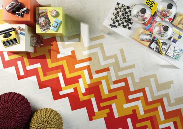
5. “You can be as subtle or dramatic as you wish with wall tiles. In 2015 the big trend focuses on a cooler colour palette with silver, grey and icy whites replacing the creams and beiges of the noughties. More offbeat trends come in the form of colourful ‘Artist Palette’ designs which are stunning when used in an otherwise all-white scheme.”
Stuart Wisbey, Director, The Stone & Ceramic Warehouse
6. “We are increasingly seeing a more confident customer making bolder colour choices. Window blinds are an obvious choice to create the look in an interior because of their ‘blocky’ aesthetic. Colours can be effortlessly combined, with for example, a border on a roller blind or alternating slats on a vertical blind or sliding panel”.
Nichola McFall, Brand Manager for The Fabric Box
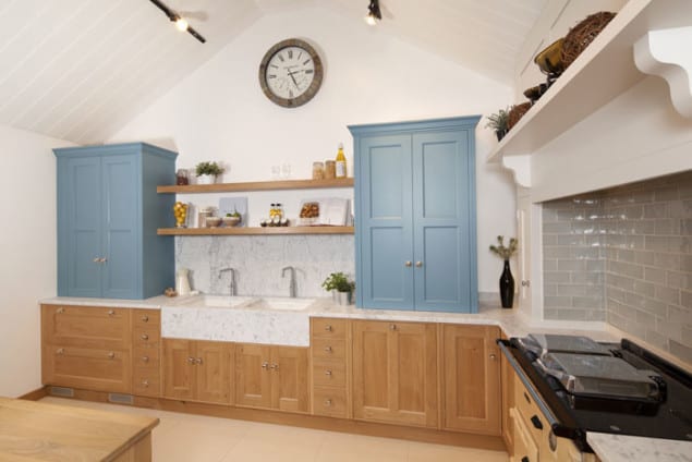
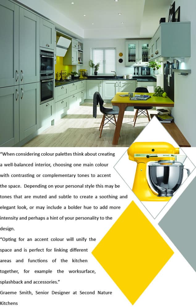
“Mixing and matching in the kitchen is a popular trend at the moment and helps to give a more unfitted feel to the room. There are several ways this look can be achieved, the most obvious being with the units. A mixture of oak and hand painted works particularly well and we would recommend using darker toned woods for the base units and lighter shades for the wall units.
“Combining hand-painted units with natural timber base units helps to create a homely feel to the room, while the hand-painted units provide unlimited scope for colour and can even be tied in to match appliances. Painted elements also give flexibility should you fancy a change of colour scheme in the future, as they can be easily updated to give a whole new look for a relatively small cost.”
John Stephens, Director, Rencraft
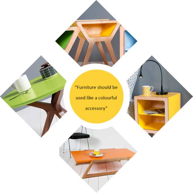
“Furniture should be used like a colourful accessory, alongside a contemporary painting, cushion, vase or rug, to add an extra focal point to your room. Mixed with neutral paintwork and soft furnishings or a bold patterned wallpaper on an accent wall, furniture with a splash of colour is the key to transforming your home and in our opinion, an essential part of any stylish interior. You can be as subtle or as bold as you want.”
Jonathan & Sarah Lear, founders of Obi Furniture
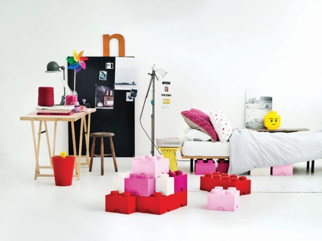
“Colour can be very important to not only brighten up your child’s room and make it playful, but to also organise their belongings. When purchasing storage boxes for kid’s toys, you should assign each child a different coloured or shaped storage box to keep their clutter in and encourage them to be responsible for tidying up after themselves.
“LEGO storage boxes are a great idea to encourage the kids to clear away their clutter and also provide a funky-looking solution for children’s toy storage. And just like real LEGO, the boxes can also be stacked on top of each other to create proper LEGO structures!”
Simon Glanville, storage expert and Managing Director at STORE
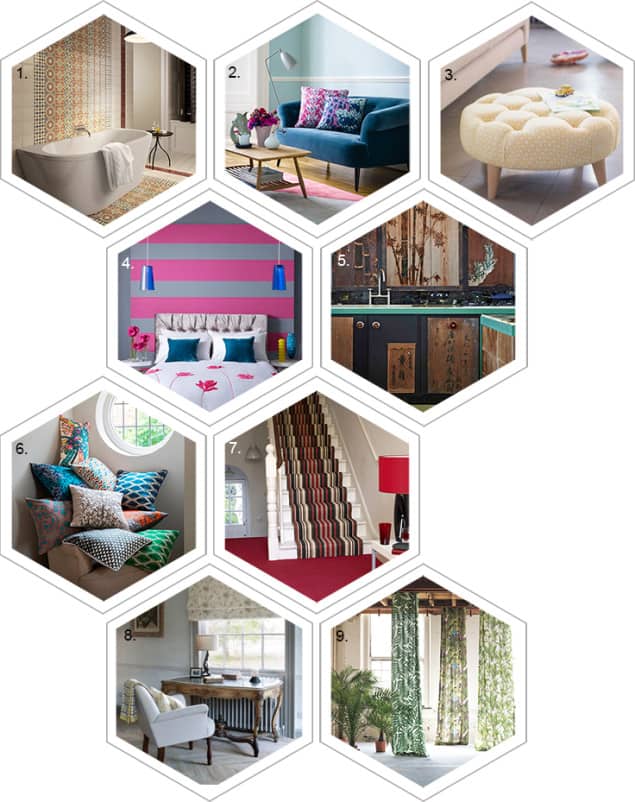
1. “Combine our new Parian collection to create a striking patchwork effect on walls and floors. The intricate tile patterns and muted jewel tones offer unlimited textural interest with each of the four unique patterns.”
Jayne Adamson, Senior Product Manager at House of British Ceramic Tile
2. “Colourful cushions are a simple, effective way to bring a look together. If you’re clever with your choice of colour and pattern, they can connect the dots in your design scheme, drawing out detail from elsewhere in the room – your wall colour, curtain fabric, and other decorative accessories.
“Bright bursts of colour and eye-catching pattern can lift a neutral setting and inject a bit of fun; as part of an already bold scheme, colourful cushions in complimentary tones bring cohesion, as shown in this block colour theme featuring our new collection of cushions by Charlotte Beevor.”
Kate Hassard, Marketing Director at sofa.com
3. “Your living room is one of the most used spaces in your home so it’s important to choose a colour scheme that suits your personality and lifestyle. If you’re colour shy, why not introduce a small pop of colour through simple accessories such as a footstool or cushions. Arlo & Jacob’s Dalloway footstool in sunny yellow is the perfect pick me up all year round. Alternatively, find a feature piece of furniture that you love, such as a sofa or armchair, and build a complementary colour scheme around it.”
Laura Barnard, Marketing Coordinator for Arlo & Jacob
4. “Once you have chosen a colour to match you wallpaper, encourage yourself to choose a second one. Using a second colour to accompany your pattern will make the room more interesting and will make buying accessories a lot easier. For the braver and for those seeking a really trendy approach to decorating then using two colours on one wall is the way forward. For this you really need to allow the creative inside you to take over.”
Jody Hudson, Junior Designer, Graham & Brown
5. “For me, colour is like a blast in a scheme, but you need to think of the whole space first before committing to using colour in it. Think about how it will work and what you want to achieve before adding paint to brush. It’s good to take inspiration from an object you’re planning on using in your scheme rather than just picking a random colour.”
Lionel Jadot, Designer & Architect at Lionel Jadot
6. “When bringing colour in to your home, start small. If you tend to favour neutral, muted tones, ease in to using colour through using colourful accessories. For the living room, try a few brightly coloured cushions for a welcoming, laid-back effect, or display flowers in the hallway in a vibrant vase that is sure to catch the eye of visitors.”
Victoria Atkin, of online furniture and home accessories company Atkin and Thyme
7. “Often bold colours are featured in hallways and stairways as this is a great space to be daring with coloured carpet. Vibrant shades in the hallway will create a welcoming space and reflect a happy home. Customers are becoming more adventurous with colour; purples and reds have become increasingly popular and work well with other vibrant colours to create a statement interior. Deep rich red tones can make a room feel cosy while injecting colour into the space. Continue this scheme throughout your home for maximum effect.”
Mike Richardson, General Manager, Kersaint Cobb
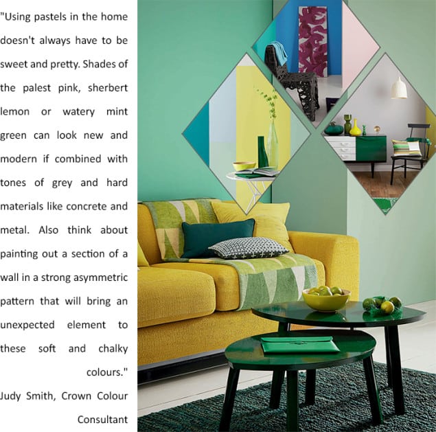
8. “Introducing colour to your home is a wonderful way to update and refresh your existing scheme without huge expense or commitment if you often like to change your mind! Remember that colour does not always have to be bold; pastels can provide a beautiful lift to a neutral palette.”
Emma Clarke, Creative Director at Clarke & Clarke
9. “Using colour in the home creates ambience, whether it is a bright petrol blue, acid yellow or soft neutral. We have seen a move away from muted colour palettes to bolder shades, particularly as 1970s-inspired interior schemes are making a comeback. This trend has been reinterpreted with a contemporary twist by colour blocking the 1970’s palette in all-over plain fabrics, such as our LUKE collection new for 2015. Nature-inspired prints remain popular, and are a great way to introduce colour for the faint-hearted. Choose a two-tone wallpaper with a subtle botanical print for a contemporary and stylish décor.”
Michael Constable, Managing Director for JAB Anstoetz
So what do you think of that folks? Has that inspired you to be bolder with colour in your own home? Do let me know in the comments.

I love the idea of a splash of colour but always a bit nervous to make such a permanent change. Before committing to a colourful wall or statement piece of furniture I’ve introduced a couple of smaller but bright and lively pieces to bridge the gap
That’s a great way to start building confidence with colour Hattie!
I have recently given in to my colourful side when I brought a gold ottoman from decur.co.uk, the footstool is great and definitely brings the room alive but my room still lacks colour and we’re weary of using a second colour. I have been looking on pinterest for some colour inspiration and this article has also helped with providing me with some much needed tips and insight.
Those statistics, if true, are shocking! I have also noticed the bland trend based on neutrals with very limited and muted colour palettes. I think it’s much harder for some people to introduce colour into their home because they don’t know how or what to do. But as a designer, who loves working with bold colours, I say to my clients that no one is grey or neutral inside. Our personalities are different and colourful and our homes should reflect that. Start with art, rug or a cushion. Find that perfect item which is “totally you”. Show your fun, adventurous side of you through accessories. Also I don’t recommend to buy stuff “because it matches my …”. Rather go by instinct and build your home with things that speak to you. It’s nice to have business pushing and showing us colours but to me it’s all in the mind.