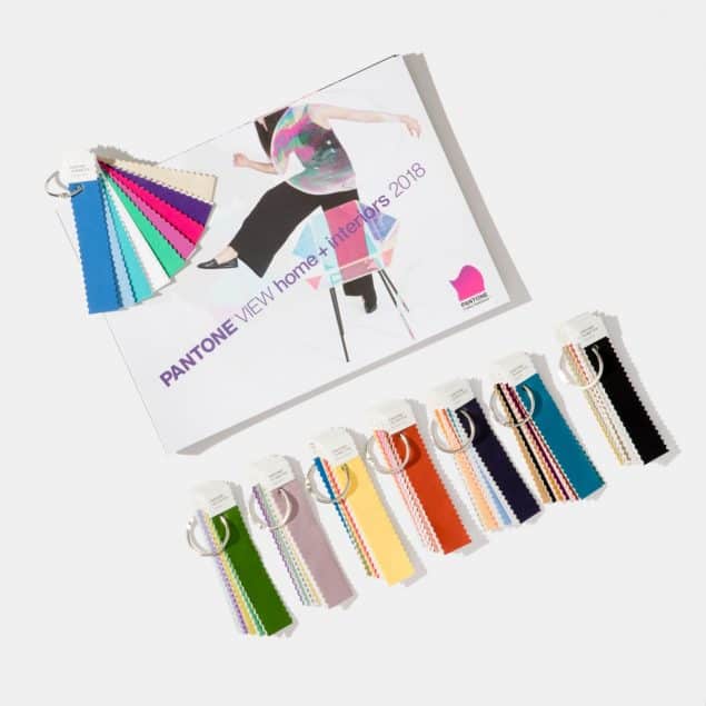
I have a really weird obsession with trends. I follow them very closely and I love to write about them and drool over them in magazines and on blogs and on Pinterest. However, I don’t always buy into them and bring them into my own home. Not unless I deem them to have longevity and I know I won’t go off them in a matter of months. Sometimes, I even find that I’m even ahead of the trends.
For example, I painted my living room green at the end of 2013, a number of years before green became such a huge trend and culminated in being Pantone’s Colour of the Year for 2017. I intend to keep my living room green despite the fact that new colours have now come onto the scene and I find it extremely harmonious and it helps me to feel balanced.
On the contrary, when indigo was announced as Dulux’s Colour of the Year for 2013, I jumped right on that trend. Navy blue has always been my favourite colour so this was a great trend for me to follow. I painted our bedroom dark blue in early 2014 and I have no intention of changing that either as I love it and I find it really calming and restful, not to mention cosy. I think I have a pretty good approach to trends. I follow the ones I love, and ignore the ones I don’t.
But I do like to share all kinds of trends with you guys, even if I won’t be following them myself. They may not be for me, but you may love them. So that’s why today I decided to do a little round up of 2018 colour trends. Here are some of the colours that have been selected as Colour of the Year for 2018. Let’s see what we think of these and whether we will be jumping on the bandwagon or nonchalantly watching it drive past.
*This post contains affiliate links which will be marked with am asterisk*
Dulux Colour of the Year 2018 – Heart Wood
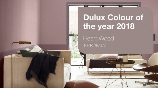
First up is Dulux‘s choice for Colour of the Year 2018, which they announced back in September 2017. Heart Wood is a warm neutral, with a hint of heather. It sits somewhere between a smoky taupe and a dusky mauve. The team of experts that selected this colour believe that it best reflects the world and cultural climate as we move into 2018. They say that it encompasses the mood of the moment, which is one of uncertainty and unpredictability.
I tend to agree that the world is unpredictable right now. The continuing Brexit saga, the wildcard that is Trump, the threat of nuclear war with North Korea, Catalonia’s power struggle with Spain, the Grenfell Tower tragedy, the attacks on Westminster Bridge, at Manchester Arena and in Borough Market in London, the Harvey Weinstein sexual assault allegations, all these things have taken us by complete surprise and we wake up most mornings not knowing what to expect from the news.
In a world of unpredictability and uncertainty homes are becoming a place to turn down the noise – shut the door on the outside world and step into a place that is uniquely ours… A Welcome Home.
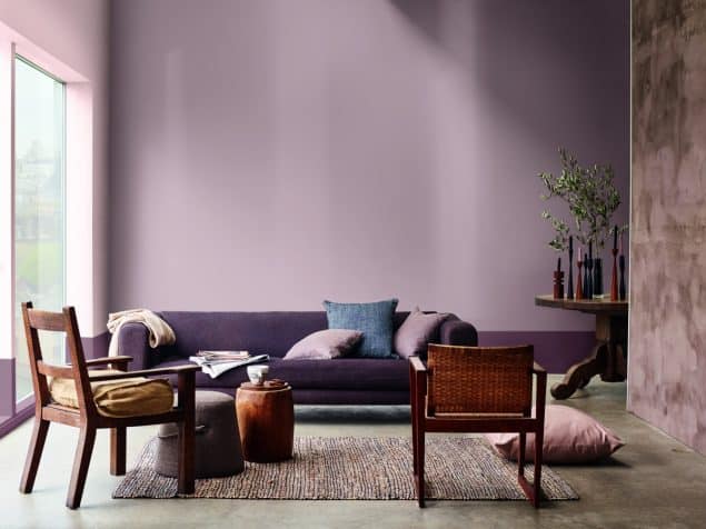
Heart Wood is inspired by the beautifully warm wooden materials that are growing in popularity. We are seeing a tendency towards warmer, light and dark shades of red, alongside violet and pinkish woods. The warmth of wood, says Dulux, reflects the comfort that we need in these uncertain times. Wood is an essential element for creating the welcoming environments we desire for our homes. It helps us to create a sanctuary where we can find balance, comfort, and restfulness.
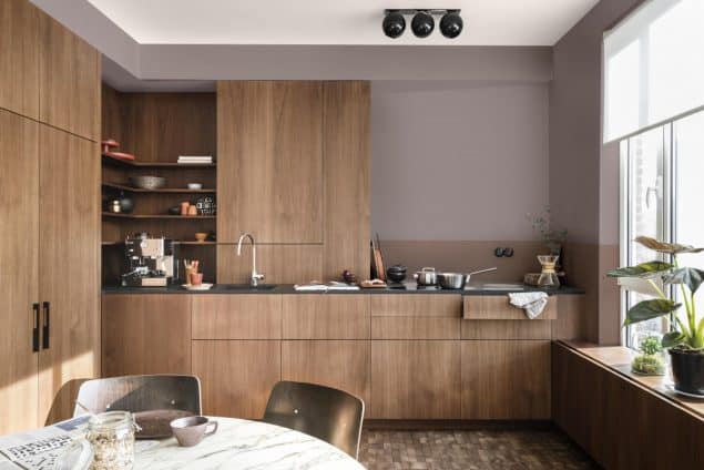
Heart Wood works incredibly well with warm woods, leather, silk and velvet to create a truly tactile space that you want to immerse yourself in. It can be used in conjunction with warm earthy tones to bring a sense of comfort, or with clay and blush pink to help calm the mind and soothe the senses. It pairs well with softer shades such as cocoa as well as the deeper, bolder tones of ink blue and purple. It also works with cool shades of blue to encourage a clear-headed approach to life, or with relaxed neutrals and sea-green to support the need for connection.
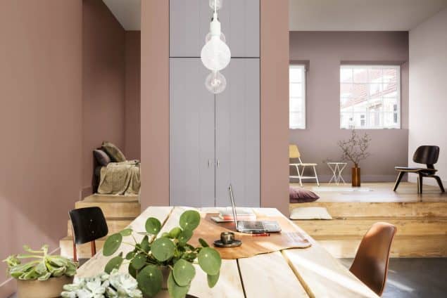
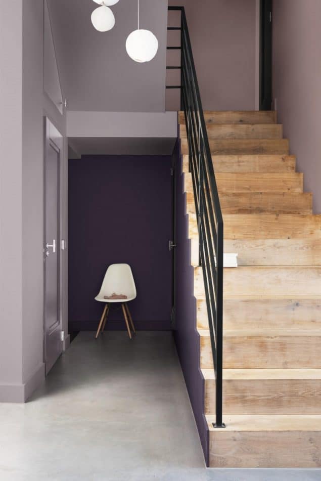
When combined with deep purple and lighter pinks, Heart Wood creates a calming, restorative and recuperative backdrops
Heleen van Gent, Creative Director, Global Aesthetics Centre, AkzoNobel
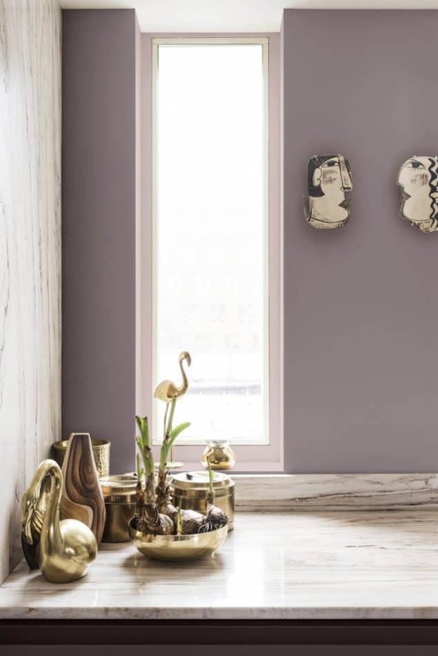
The versatility of the Heart Wood home palette gives consumers the freedom to balance softer shades with deeper, bolder tones.
Heleen van Gent, Creative Director, Global Aesthetics Centre, AkzoNobel
Get the Look!

Dulux Heart Wood Paint | Lamp | Rug | Clock | Bedspread
Light | Bedlinen | Artwork | Round Rug | *Sofa*
Pantone Colour of the Year 2018 – Ultra Violet
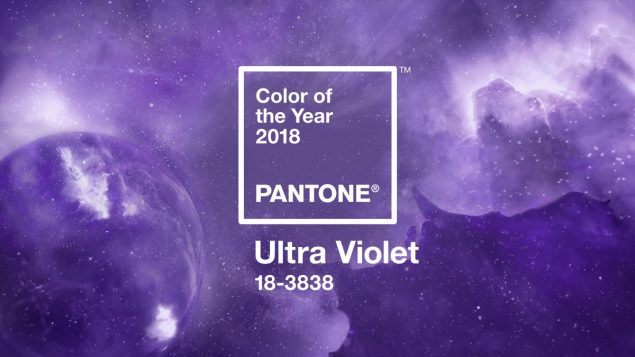
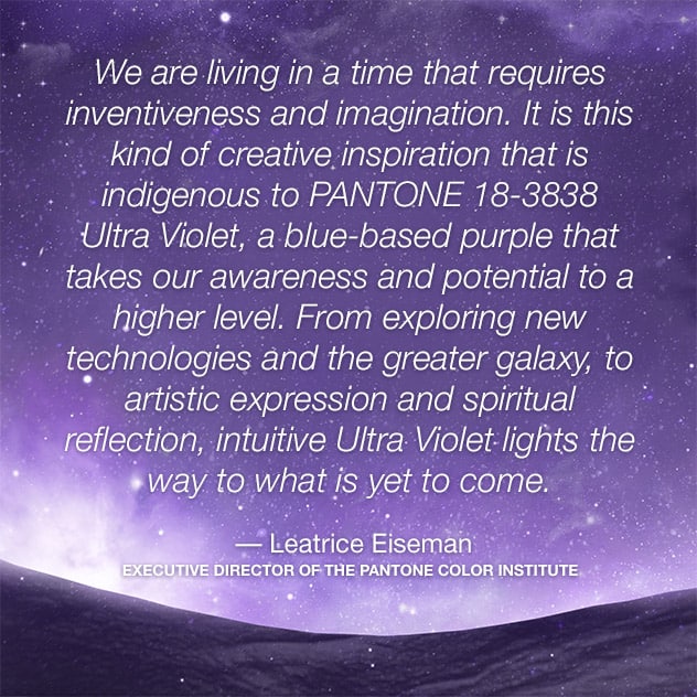
In December 2017, Pantone, the global colour authority, announced Ultra Violet as its Colour of the Year for 2018. I suppose it’s not a million miles away from Heart Wood, being from similar colour families at least. But Ultra Violet is a very bright and very bold shade of purple. Pantone describes it as “a dramatically provocative and thoughtful purple shade” and says that it “communicates originality, ingenuity, and visionary thinking that points us toward the future.”
Complex and contemplative, Ultra Violet suggests the mysteries of the cosmos, the intrigue of what lies ahead, and the discoveries beyond where we are now. The vast and limitless night sky is symbolic of what is possible and continues to inspire the desire to pursue a world beyond our own.
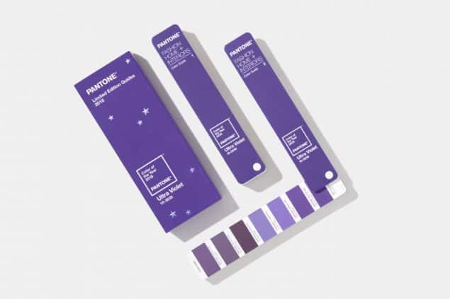
This shade of purple has, over the years, become symbolic of counterculture, unconventionality, and artistic brilliance. Ultra Violet makes us think of musical icons such as Prince, David Bowie, and Jimi Hendrix who were renowned for their individuality. This colour represents experimentation and non-conformity, and encourages us to push boundaries through creative outlets.
Pantone also says that there is a mystical or spiritual quality to Ultra Violet as this colour is often associated with mindfulness practices. Purple-toned lighting is often used to energize and inspire connection.
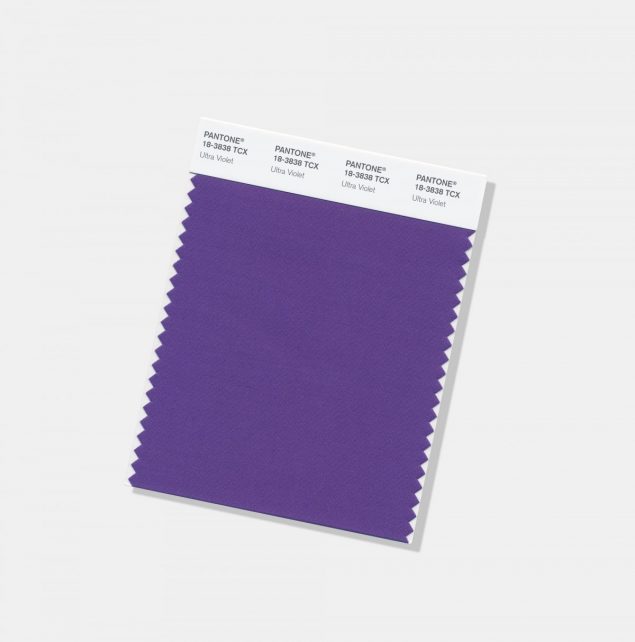
The Pantone Color of the Year has come to mean so much more than ‘what’s trending’ in the world of design; it’s truly a reflection of what’s needed in our world today.
– Laurie Pressman, Vice President of the Pantone Color Institute
Get the Look!
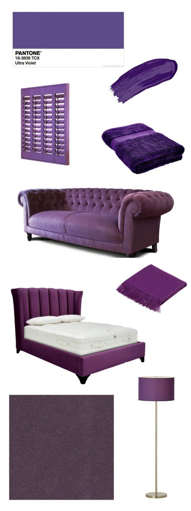
Paint | Shutters | Towel | Sofa | Throw | *Bed*
Carpet | *Furniture Village*
For tips and advice on how to use Ultra Violet in your home, I recommend this great post over at Dear Designers blog.
Benjamin Moore Colour of the Year 2018 – Caliente
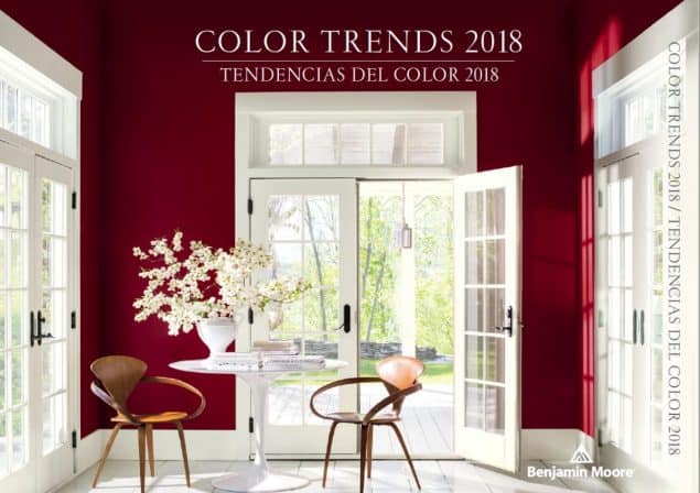
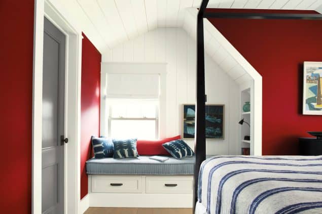
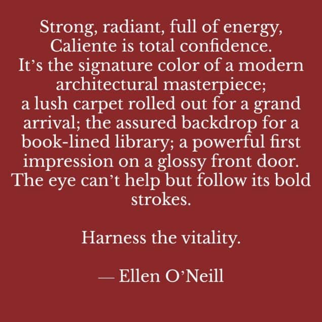
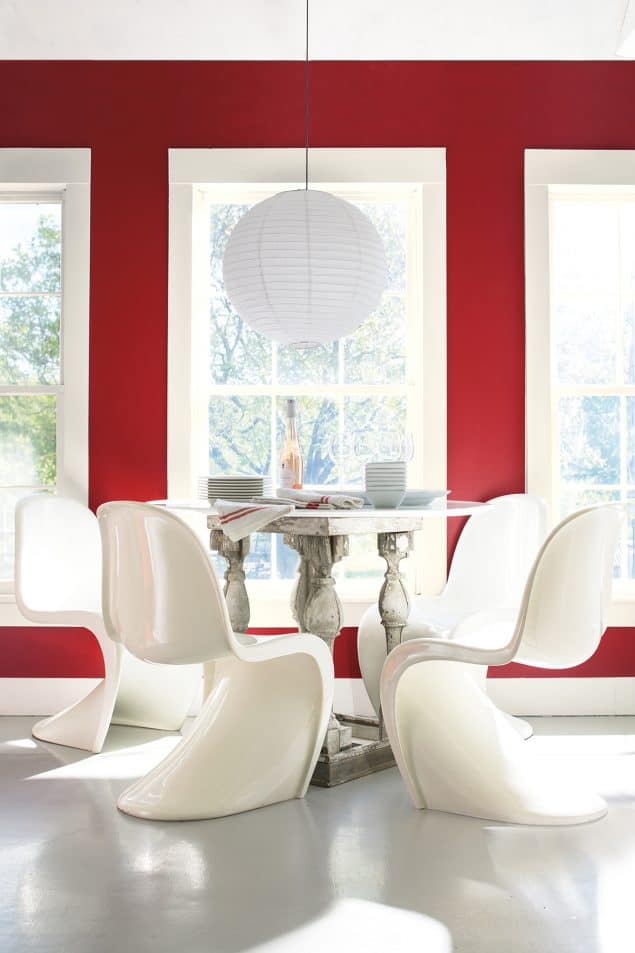
In October 2017, North American paint brand Benjamin Moore announced its own Colour of the Year for 2018 : Caliente. Caliente is a warm and seductive red reminiscent of elegant stately homes. This vibrant and charismatic shade of red is a bold yet soothing contemporary colour that oozes confidence. It is not as shocking as primary red as it has a brown undertone that makes it more soothing and enveloping.
Again, it is not far away on the colour wheel from Heart Wood or Ultra Violet and Benjamin Moore uses much of the same reasoning for this colour choice, but takes things a little further. In an interview with Architectural Digest, Benjamin Moore’s director of strategic design intelligence, Ellen O’Neill, states that whilst red brings comfort and provides us with somewhere cocooning to retreat to, it also represents our voice and using that voice to speak out and protest against things that we feel aren’t right.
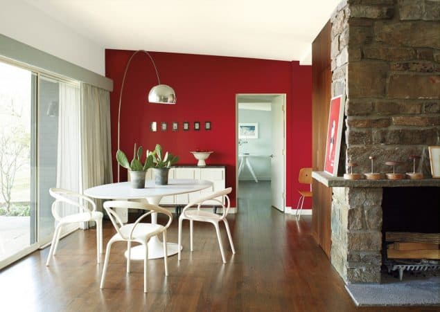
The Benjamin Moore Colour & Design team undertook a year-long research project taking inspiration from art, design, architecture, pop culture, fashion, home furnishings and more, and at the end of this journey they discovered an emergence of red hues, embodying the change, strength, confidence and vitality that permeates cultural movements around the world.
Get the Look!

Paint | Sofa | Cushion | Clock | Light | Throw | Cabinet | Rug
So there you have it guys, a quick round up of 2018 colour trends and a look at the three colours that have been announced as Colour of the Year 2018. What do you think? Which is your favourite? Will you be using any of these in your home this year? Personally I’m going to opt out of all of them. I’m still in love with the greens and blues from the past few years and I’m not yet ready to move on. I do rather like Heart Wood and my parents have a very similar shade in their home, which is lovely. But I absolutely couldn’t live with Caliente or Ultra Violet. I find them both much too energizing and I need relaxing shades in my home. What about you?

I hadn’t picked up on the Caliente, love it and of them all I think has the most longevity potential….
That red is quite a statement but I like it!
It won’t go unnoticed that’s for sure!
Hey Stacey! Love the Dulux colour, could really live with that. It’s so calming and warm too. Not so sure about the Pantone violet!!
My thoughts exactly!
I like heartwood the best as it’s such a versatile colour that you can pair with bright colours. I’m not a big fan of ultraviolet though! Great selection of images for how to style these colours in your home.
Thank you. I tried to pick products that are easy to switch out if you change your mind later.
What a great blog! Nothing like some real insight into colour. Particularly loving the Heart Wood too!!
Thanks Tom, that seems to be a popular opinion!
Fantastic roundup. I agree with you, trends are fascinating to watch and fantasise about. However, like you mention not every trend is for everyone. Last year I did embrace greenery, colour of the year and a bit of tropical vibe too. I think I will keep it that way as I am trying to slowly turn my home into an urban jungle.
Me too Anna, I’ve gone a bit mad for plants although my home isn’t flooded with natural light so I do struggle to keep them alive.
I’m not every so keen on Ultra Violet or Caliente – they are a bit over the top for my taste though I expect they could look good in the right room. But I do like Heartwood, it looks like it would be very versatile. x
I think Heart Wood would make a good neutral actually. There are so many colours that it looks good with!
I think we will see a toned down version of the Ultra Violet in Lavender and Lilac coming through. Pantone also featured bold reds like caliente in their spring colour report too. I think they’re going to make an impact.
I agree with you on the lavender and lilac, plus those shades are so much easier to use!
I am not the one to follow trends as I think they come and go and at the end of the day you need to feel comfortable in your own home.. I do like to see what’s ‘on trend’ and whether or not I would invite it in my home (same as you). I love the heart wood colour as it is soft and so lovely, still not sure about the purple (never been a fan!) Great post !
Same here Evija. Heart Wood is lovely and calming but can’t say the same about the other two colours.
There are so many interesting colour trends around this year – this is a great round-up. Still not sure what I think of Pantone’s choice though!
I really can’t get on board with it. Not even just accessories. Much too bold for my tastes.
Much like you (and Carol) I like some trends but don’t follow them all unless they really resonate with… the husband! Yes, the other half has a say in all this interiors madness and while I like pushing him out of his comfort zone there are times I know not to even mention… Caliente: our door is like that and we’d like it changed. Heart wood: I love this colour and have often toyed with the idea of painting the living room, but then it will look nothing like the rest of the home (and it’s a big room too). I love your green living room too, don’t change it (yet!)!
Luckily my husband normally let’s me take the reins when it comes to decorating our home. Not sure if we have similar tastes or he just doesn’t care.
Complete agree with your conclusion. Heart Wood is interesting and versatile colour. But Ultraviolet and Caliente are too aggressive.
It makes me feel stressed just looking at those two colours. Definitely not for me.
It’s great to see all the colour trends wrapped up so nicely in one place and with lots of ideas of how to use them.
Thank you. I actually have no idea how to use Ultra Violet lol
I really like Heart Wood, it’s an interesting neutral! As much as I like the connotations of Ultra Violet, I just think it’s so unworkable for most people. My taste is pretty bold, especially with colour, but I couldn’t have electric purple walls in my home!
Definitely not. I’d feel constantly wired.
I’m not sure that I like any of the colour trends, to be honest. I’m a bit like you in preferring blues and greens. I could stretch to Caliente for a couple of accessories but other than that, hmm, perhaps not. A dedicated follower of trends I will never be.
Blues and greens over these colours any day. I’m sure they could look lovely…in someone else’s home!
Wow, this is one of the most comprehensive posts on all the new colour trends that I’ve read.
Ah thanks Rachel. That means a lot as it did take a while to put together.
Thanks for the mention Stacey. I’m with you. I’ll report all the trends but still stick to the ones that really resonate with me. Having said that, I’m coming round to the idea of Heart Wood at home. x
I simply couldn’t afford to redecorate for every new trend and I wouldn’t have the time even if I had the money.
Oooo I did a similar look myself this week. Loads more warmer tones coming through by the big brands aren’t there? I suprisingly really like Heart Wood!My hopes for the year are more teals and lavendars :)
I’ve never been a big lavender fan but we accidentally painted our hallway in a lavender shade and I actually really like it. Although it’s not as warm as Heart Wood.
My dining room is so similar to HeartWood, and it really does feel like a tranquil warm sanctuary
It is a very comforting colour, almost like a little hug.