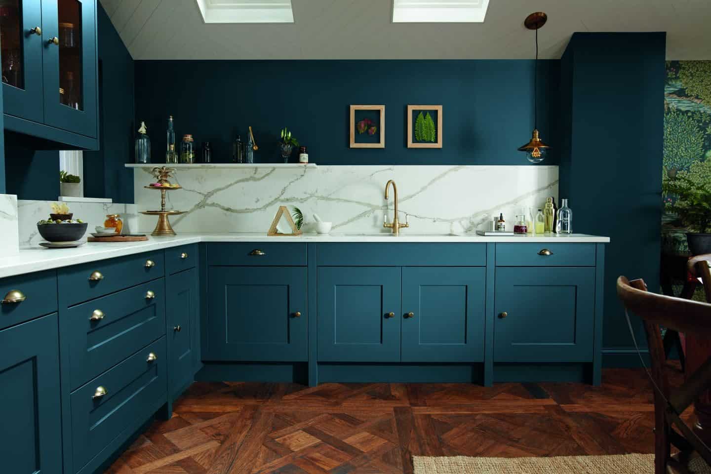
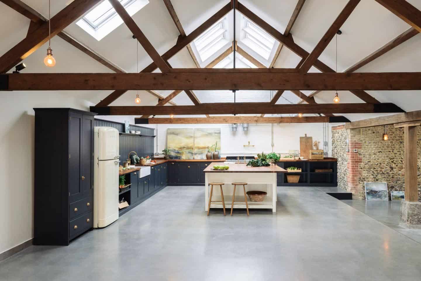
Kitchens may be the heart of the home, but for a long time, they have been playing it very safe when it comes to aesthetics. If they are going to take a risk, consumers usually choose to introduce colour with smaller items such as vibrant splashbacks using cut plastic sheeting and colourful worktops, or accessories such as a cook’s companion. But we don’t often see huge statements being made in the kitchen.
Don’t get me wrong I have seen some seriously beautiful and super exciting kitchens at the very high end of the spectrum. I’ve been to kitchen trade shows where the kitchens I’ve seen have totally blown me away. But I guess when money is no object you’re probably going to be more likely to want to make a massive statement with your kitchen. At the budget end of the scale where regular Joe shops, it’s a tad harder to find something that really stands out.
For many years, the cabinet colours of choice have been white, grey, beige, black, brown and any other colour you’d care to mention on the monochrome scale. It’s all been a little unadventurous and safe. Recently though, there has been an exciting development in kitchen design and we have been seeing some really bold statement colours coming through.
Richard Davonport, founder & MD of Davonport says:
“Choosing a kitchen colour scheme is no easy task. Often people choose a muted, neutral tone; grey, cream or even white. However, colourful kitchens are becoming increasingly common. The kitchen has become such a fundamental part of the home it makes sense to express yourself via its aesthetics and this is increasingly by adding colour. Whether that’s a whole kitchen in a bold hue, a statement pantry or island set against a calmer backdrop, or even avoiding the cabinetry all together and instead adding colour via the splashback or tiles.”
Lloyd Touwen Pluck, co-founder of Pluck, agrees: “The use of colour has become more popular in part due to a rejection of the white blandness that has pervaded lots of kitchen design – people are looking for something other than monochrome. Carefully chosen colours will lift and enhance a space and can be timeless. Going forward we think you’ll start to see more of coral pink or peach tones.”
I’ve been watching these colour developments with interest for a while now and I thought it was about time I did a little round-up of some of the most popular kitchen colours that are starting to filter through from the super high end of the market, down to the mainstream and that people like you and I may soon be able to afford.
Just to make sure that I was on the right track with the colours I’m about to highlight, I put a call out to industry experts to get their market insights and see if my predictions were correct. I’m happy to report that my trend-hunting instincts were spot on. So let’s take a look at the colourful kitchen trend in more detail.
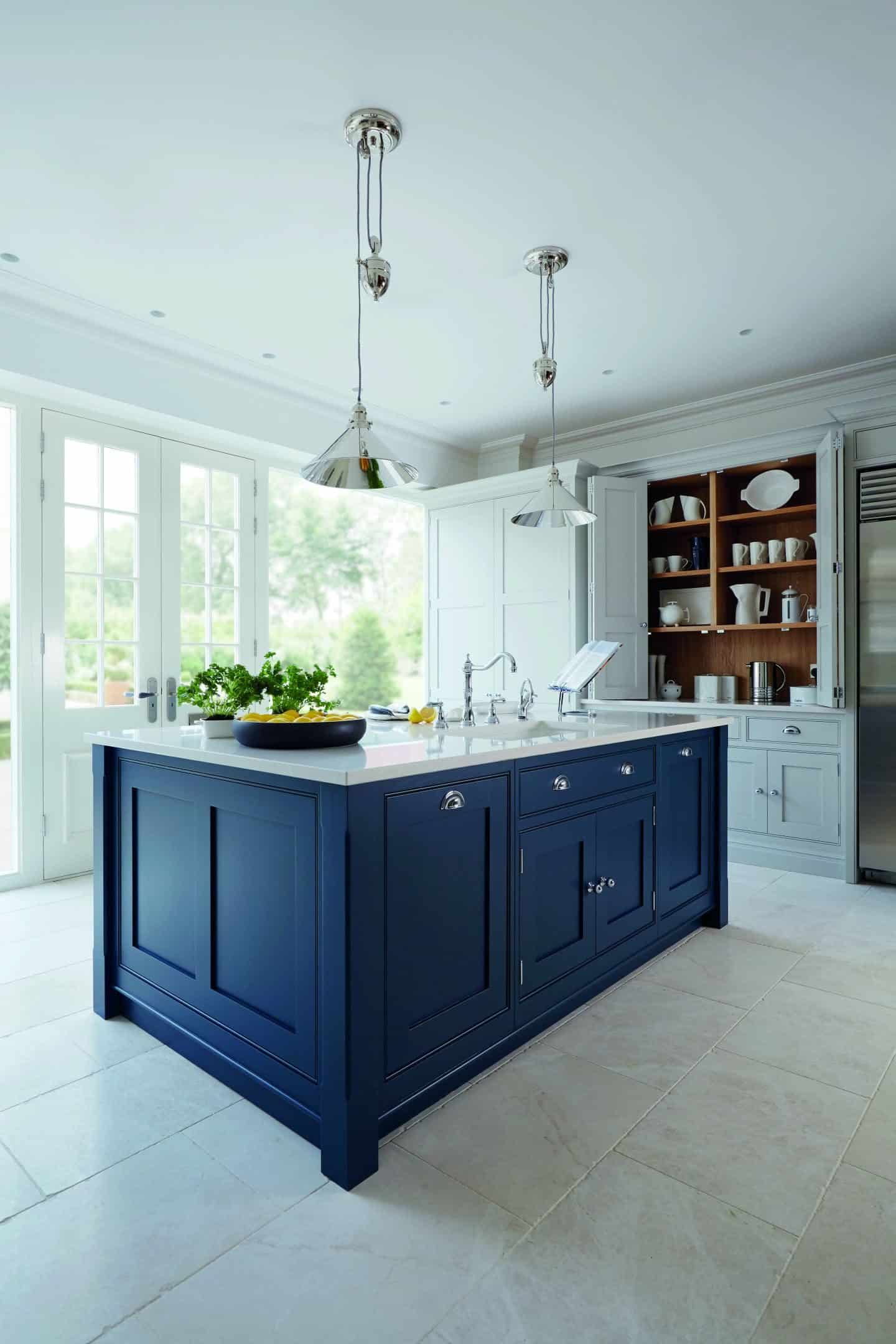
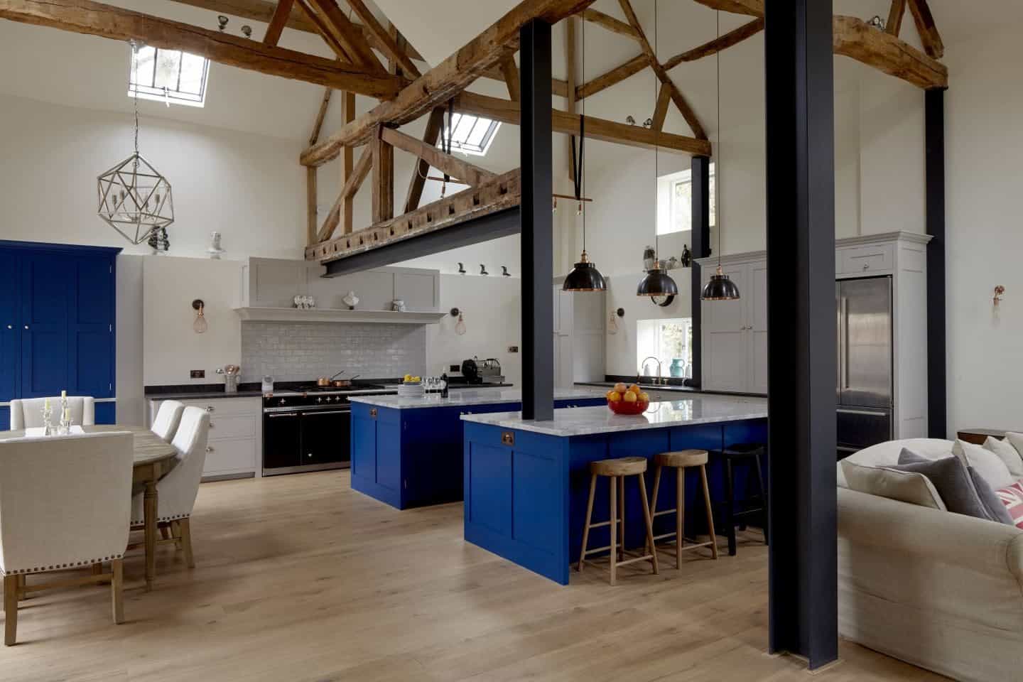
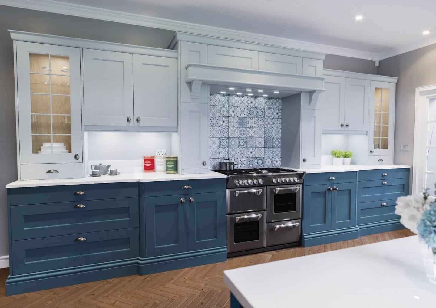
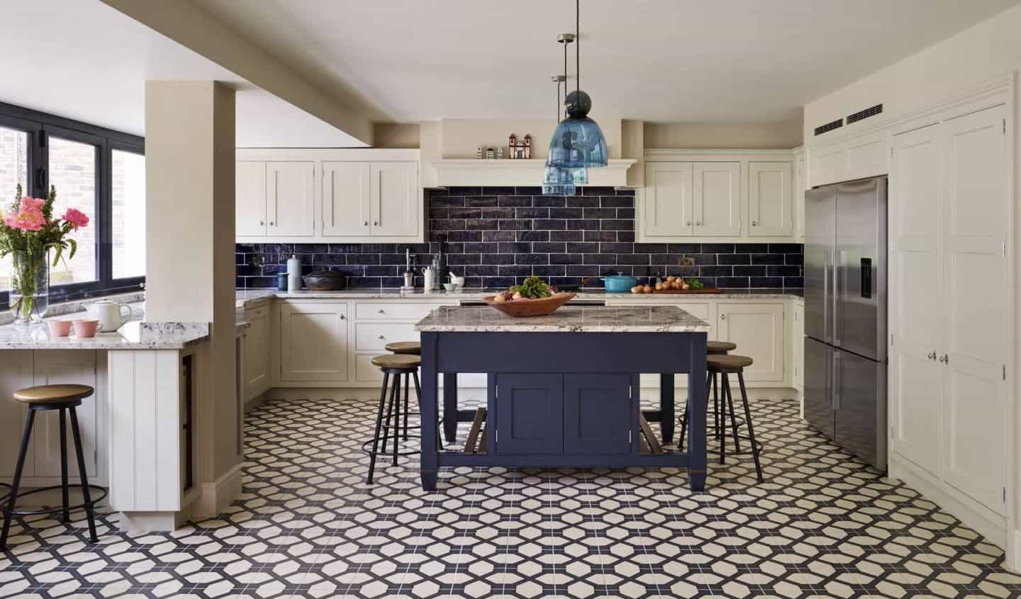
1. Moody Blue Kitchens
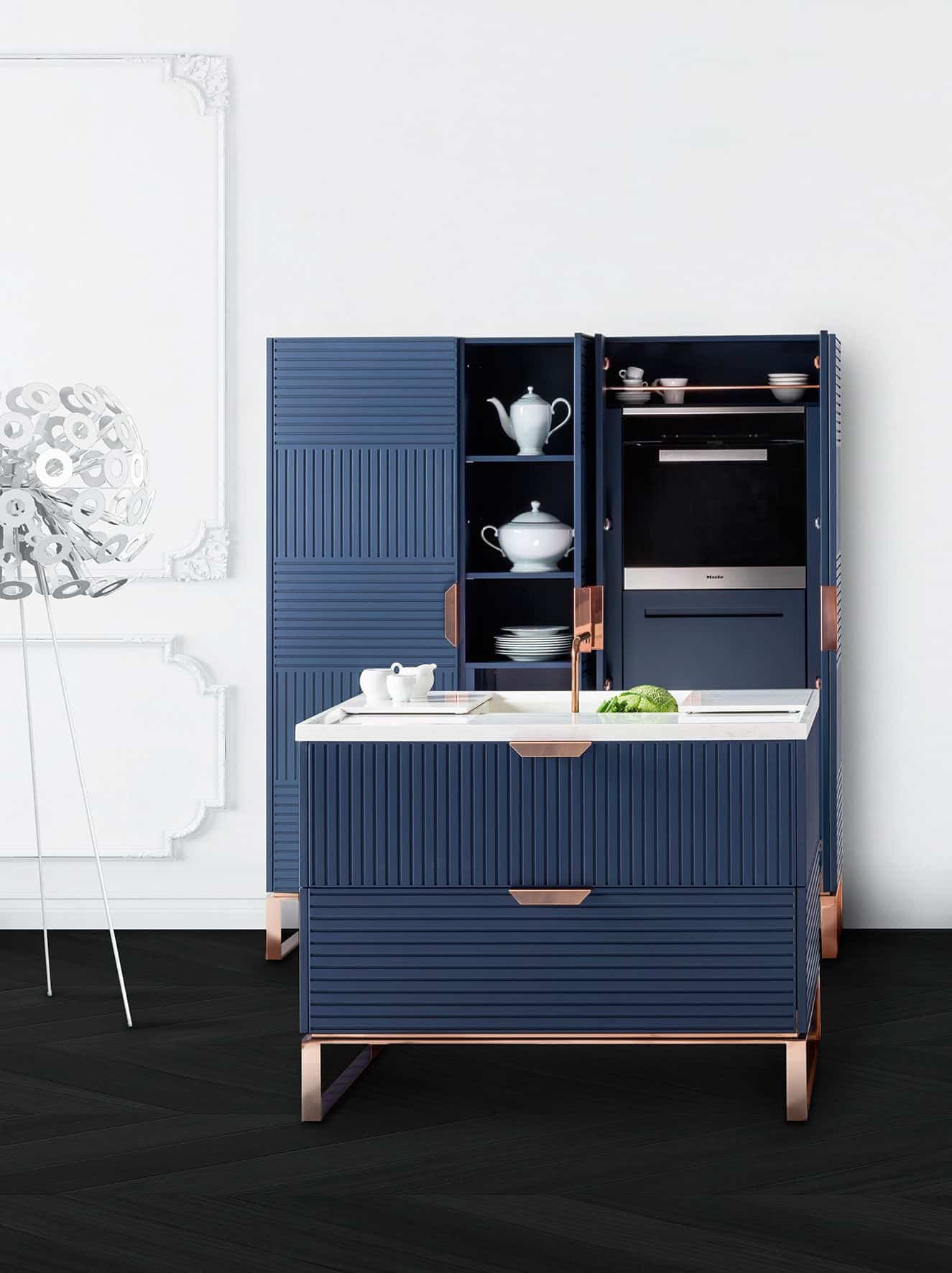
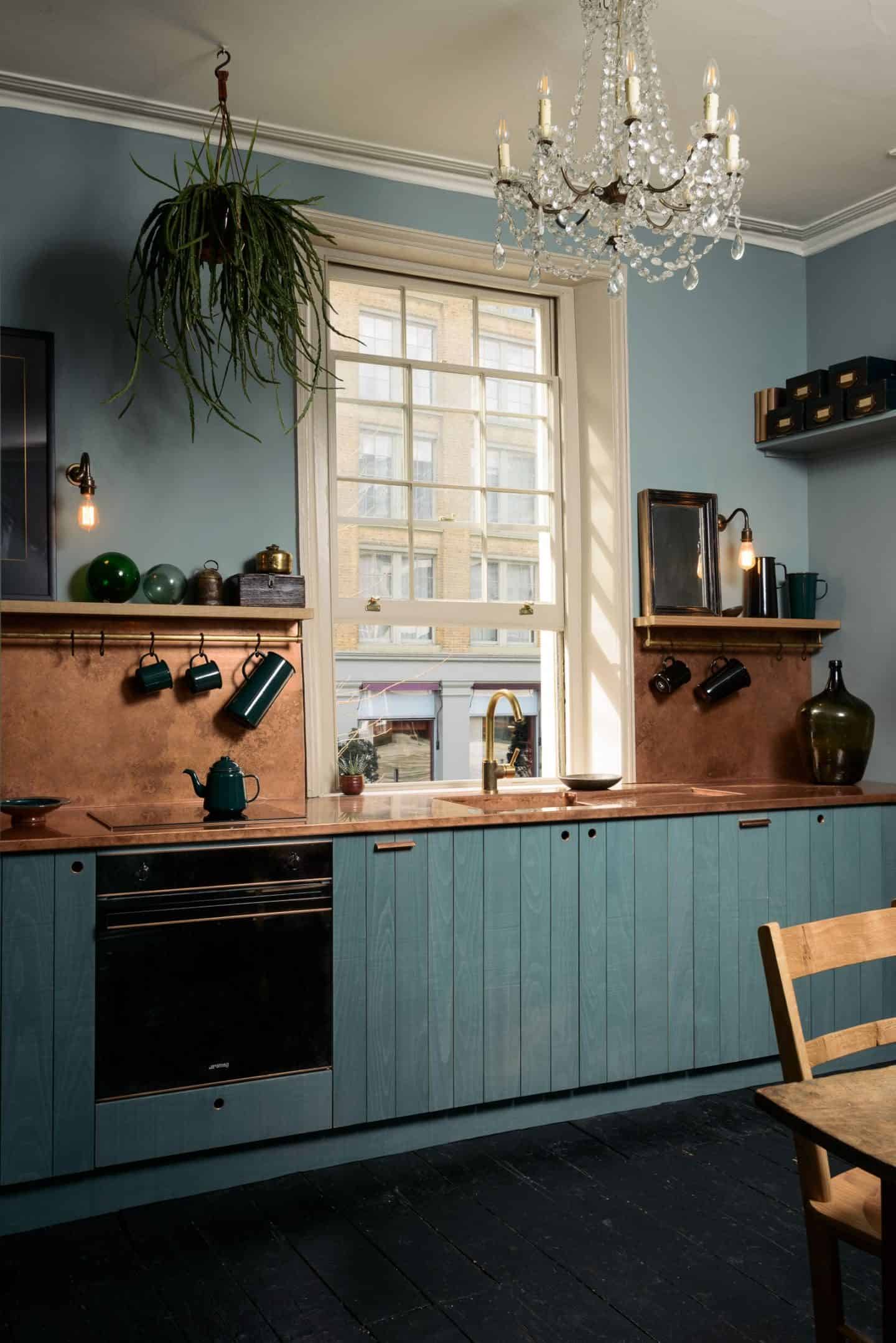
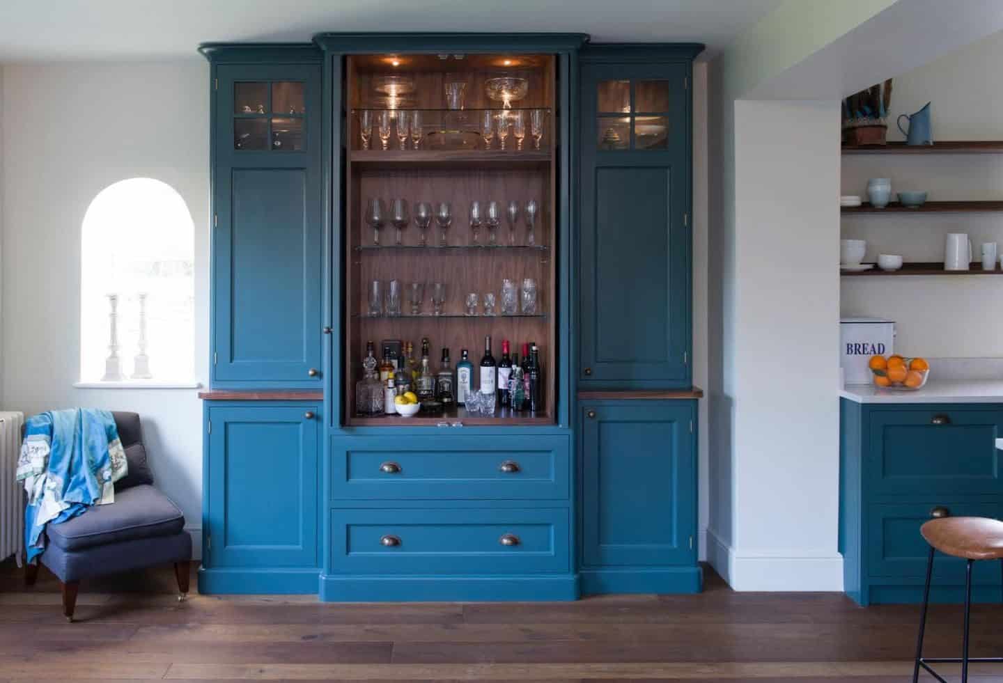
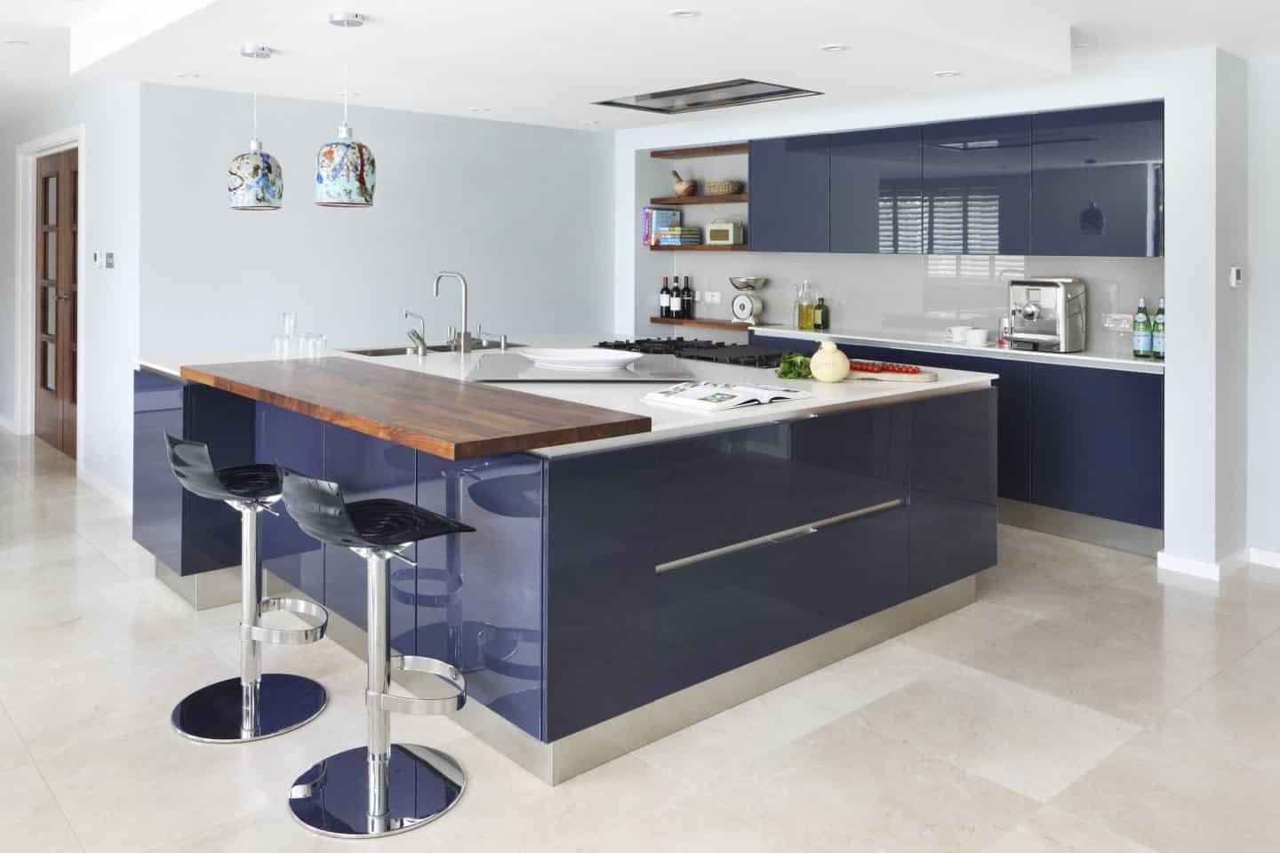
Back in 2014, I wrote about the trend for moody hues and inky blues in interiors. Interior magazines have been awash with beautiful images of rooms painted in the deepest, darkest shades of blue for a few years now as people have embraced a darker, more cosy colour palette at home. A few years later and these same moody blues have been making waves in the kitchen. Experts agree that blue has been the biggest colour trend in kitchens over the past year or two and we’ve seen every shade of blue going. Darker shades such as indigo and midnight blue have been most popular due to the flexibility and versatility that they offer.
Andy Briggs, resident interior designer at Optiplan Kitchens says:
There is a huge interest this season in dark tonal shades mixed together with lighter textured finishes. Indigo blue kitchens are becoming more mainstream and when designed correctly, can make a real statement in your home.
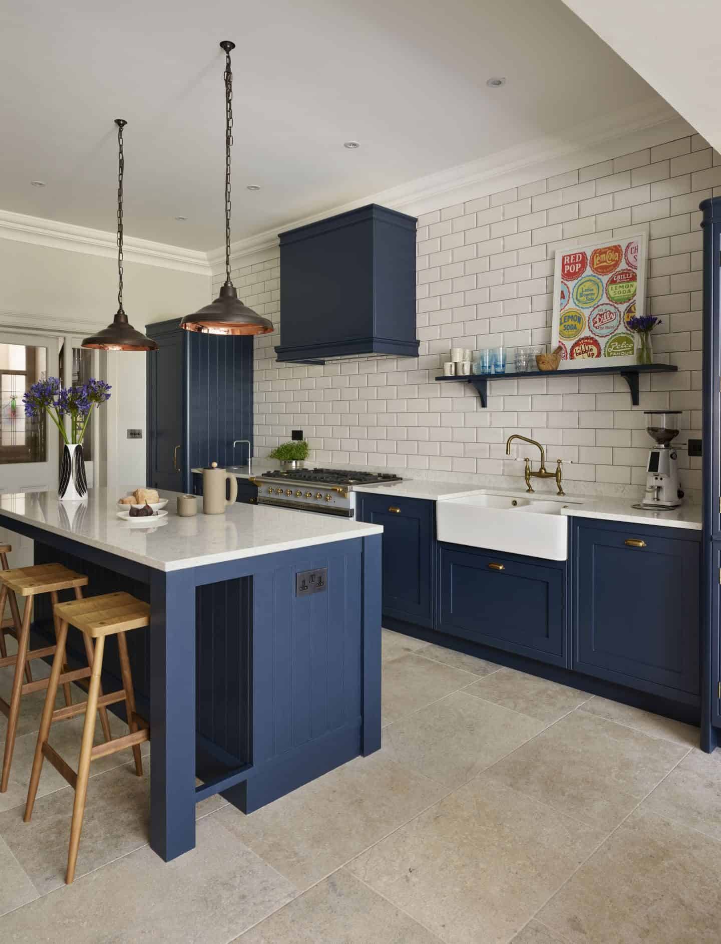
Mor Krisher, Chief Designer at Caesarstone says: “Blue speaks of sky and sea; a feeling of being free and this can easily translate to your kitchen colours, too. Whether you go for all-out blue on the furniture or stick to accent pieces with curtains, cushions and kitchen textiles, there are so many surfaces that will suit this shade.”
The darker blues have often been paired with copper which gives it a real sense of warmth and glamour. Copper door handles and drawer pulls feature heavily along with copper lighting and kitchen brassware. However, as the copper trend has become more mainstream we’ve seen brass making a move to knock copper off the top spot.
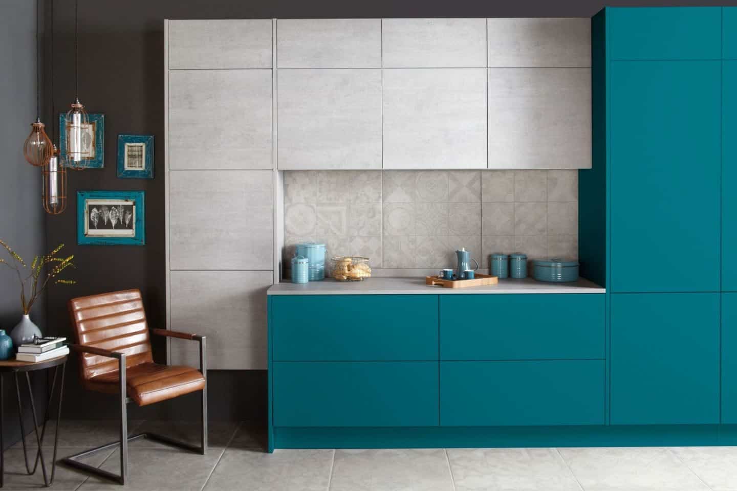
This year we have also seen a slight change in direction and these dark blues have started to lean more towards vibrant teals and turquoise and we are sure to see these colours making much more of an impact throughout this year and into next.
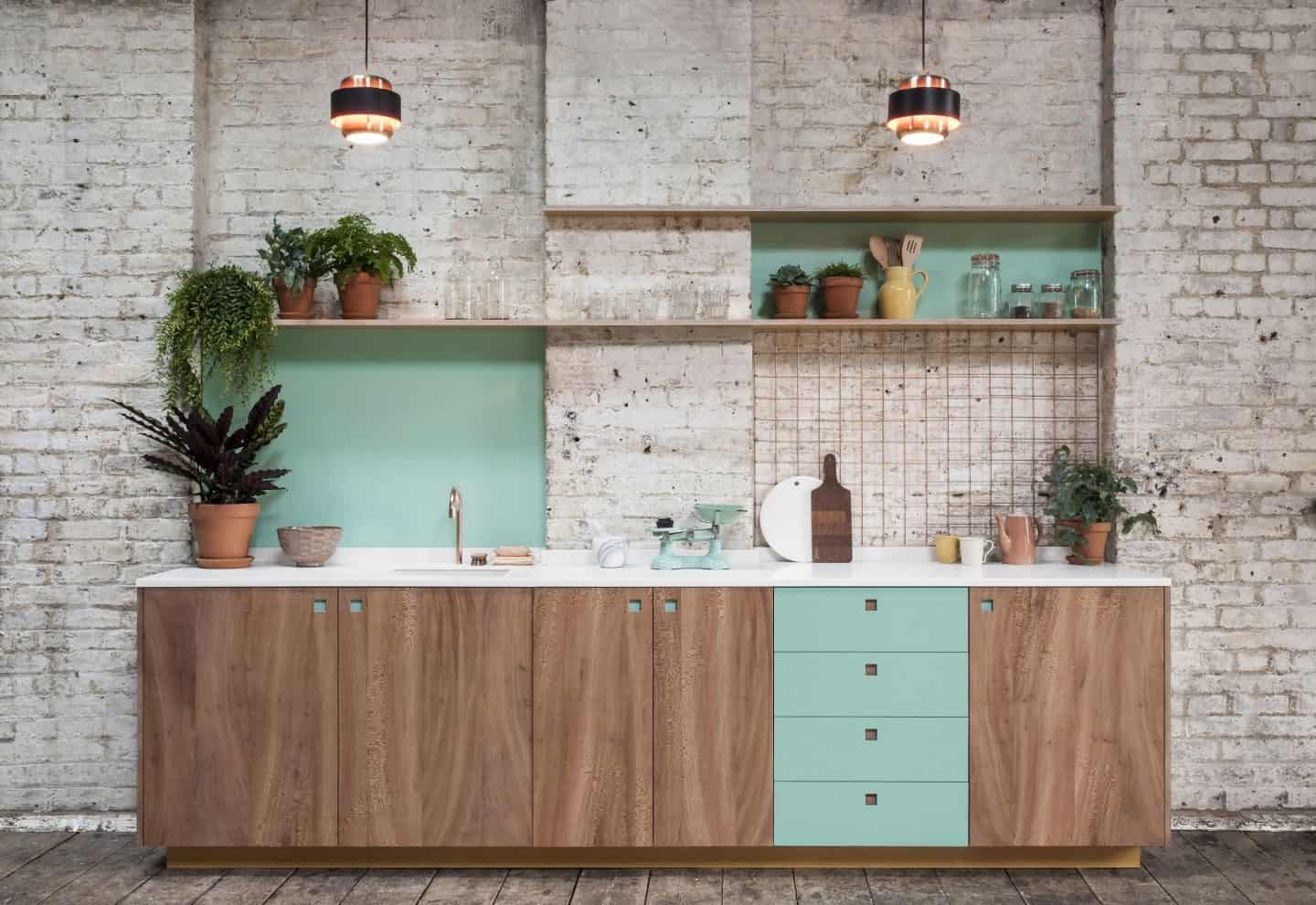
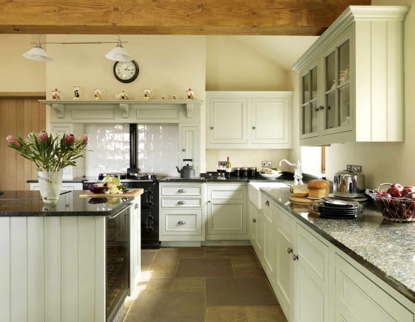
2. Green Kitchens
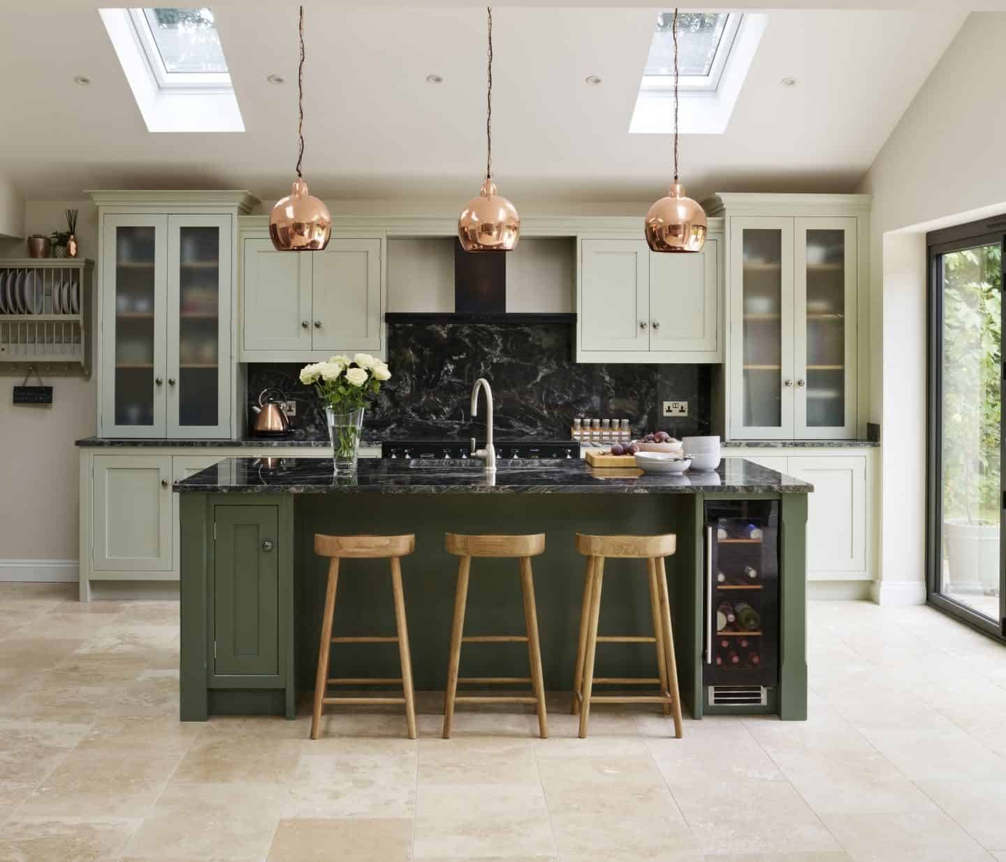
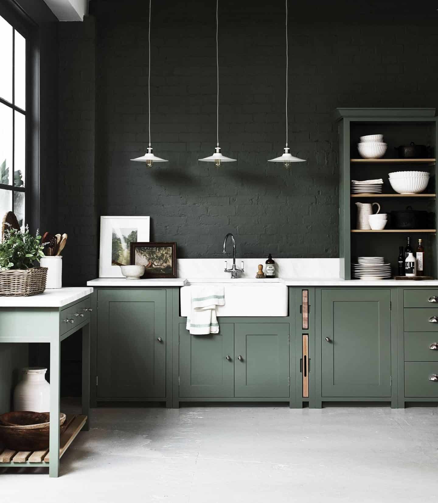
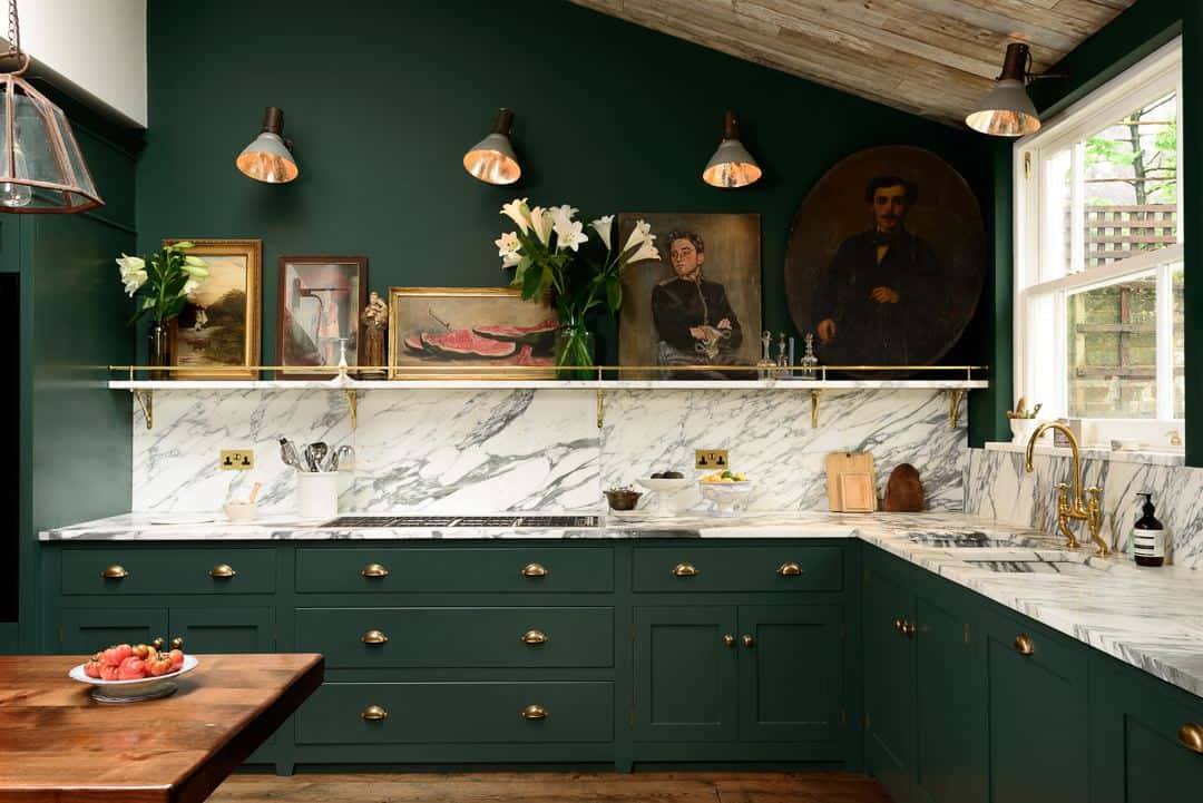
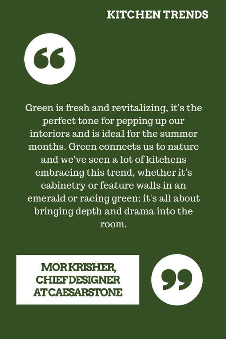
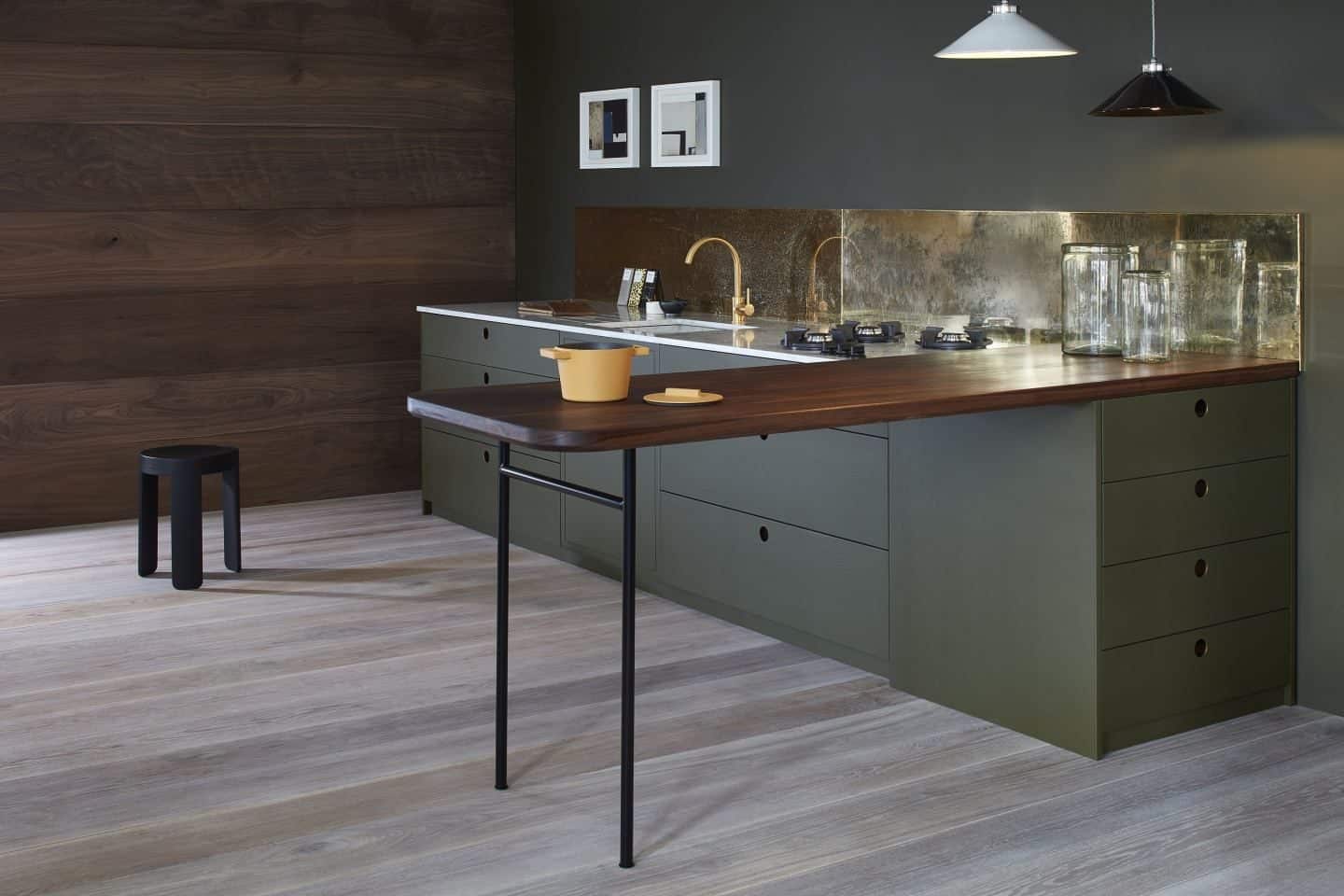
Greenery may have been Pantone’s Colour of the Year for 2017, but, as always, it does take a little while for these trends to filter down to home interiors. And whilst that bright and vibrant shade of green was a hit with Pantone, the interiors industry opted instead for much deeper, darker and muddier shades of green like moss, olive, forest, seaweed, sage and midnight green. These darker shades are a perfect partner for the earthy tones that are also on the up like terracotta, clay, sand, ochre and sienna.
Certain shades of green also add a heritage flavour to kitchens, harping back to simpler times. British racing green in particular adds a real sense of elegance to the kitchen.
Green is only just starting to make its mark but watch this space. Green kitchens are going to be the next big thing!
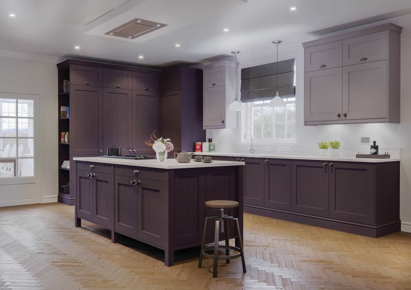
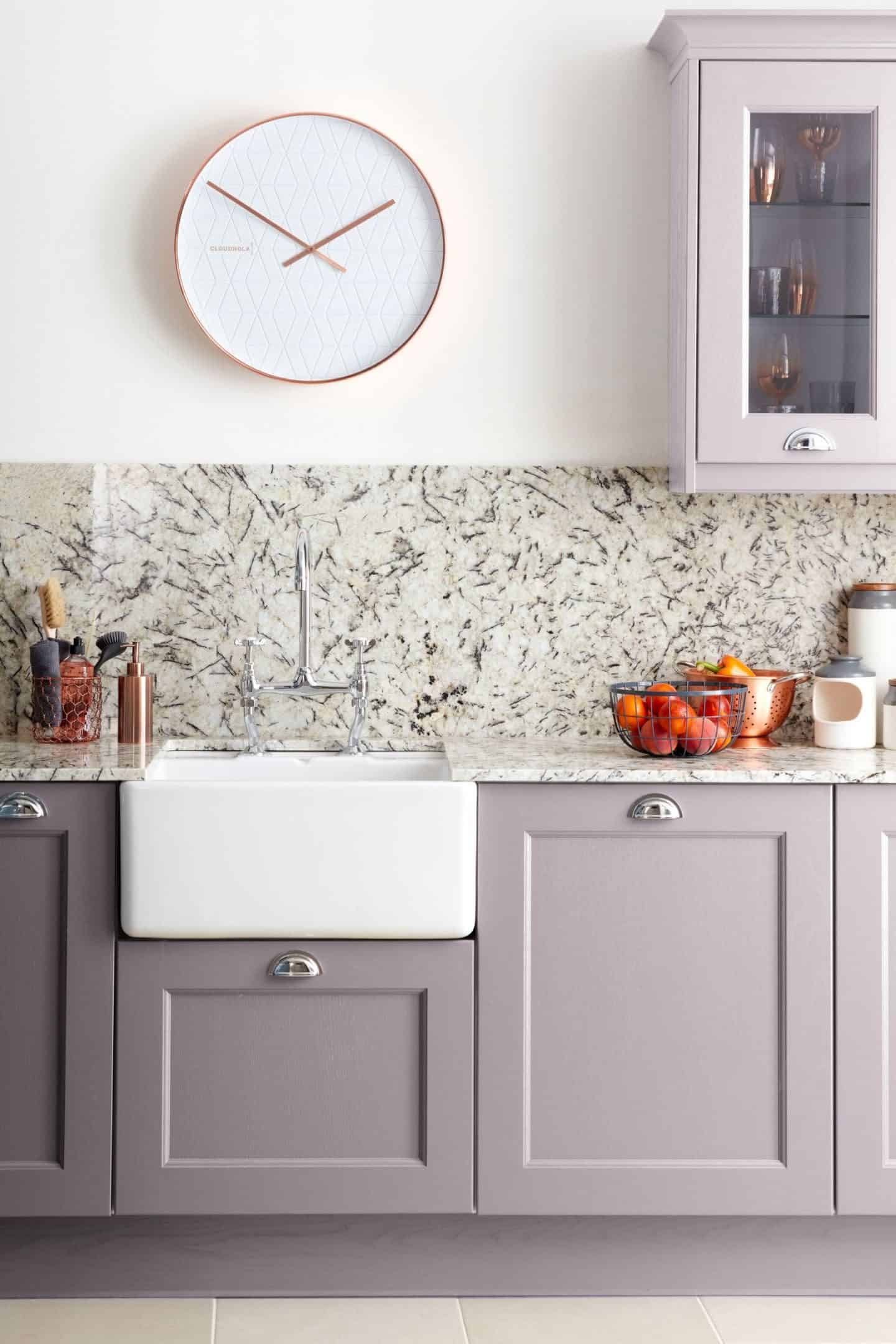
3. Purple Kitchens
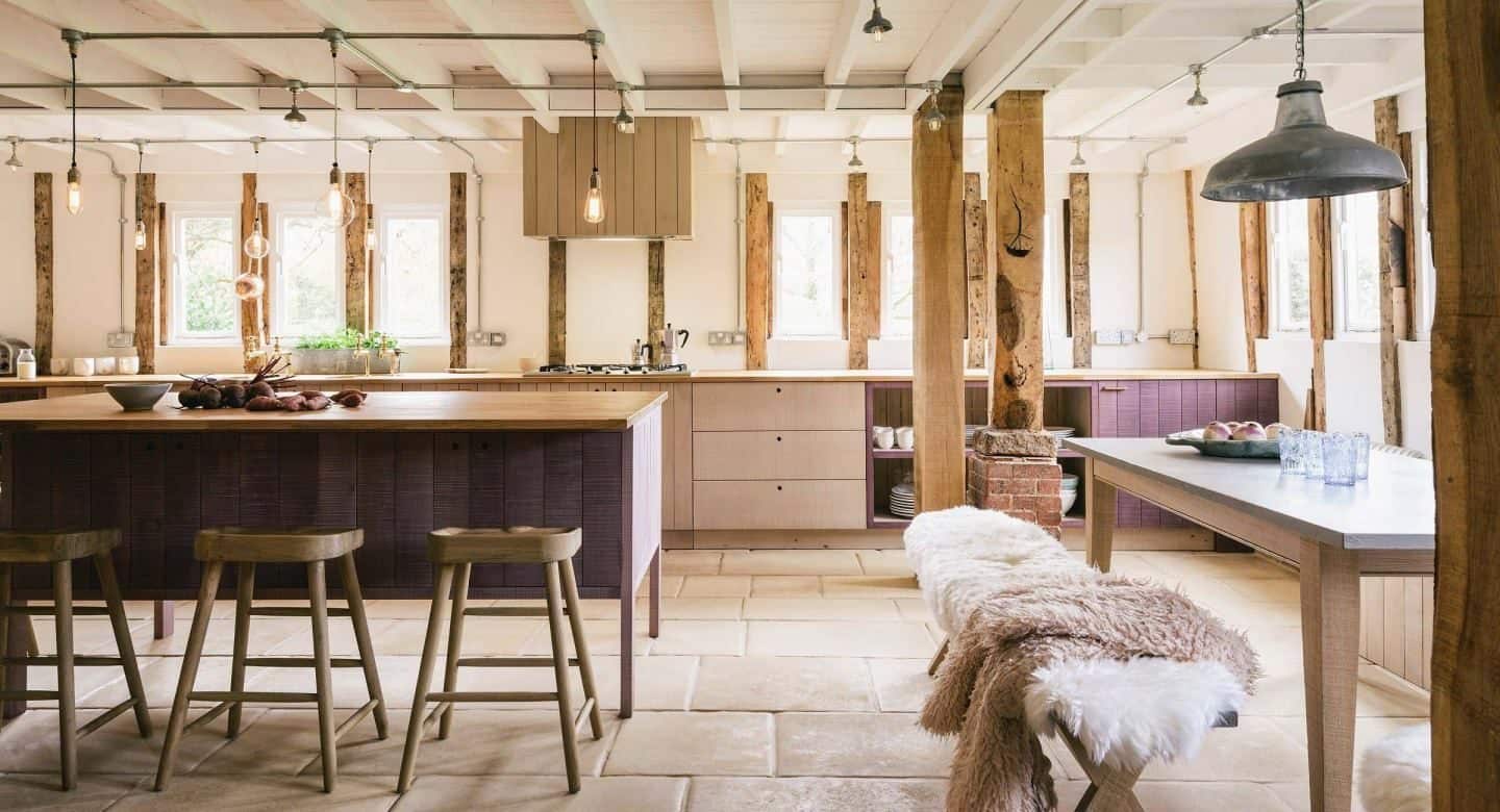
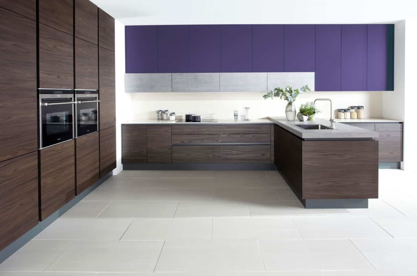
Earlier this year, Pantone announced Ultra Violet as its colour of the year. Slowly but surely we are now starting to see this vibrant hue filtering down into our homes. Initially, I wasn’t a great fan of this shade of purple and I’m still not convinced. However, seeing a couple of these kitchens below in a more muted shade of purple, I have to say it is starting to grow on me. Both LochAnna and deVOL have really pulled out all the stops here to make this colour work in the kitchen.
4. Pale Neutral Kitchens
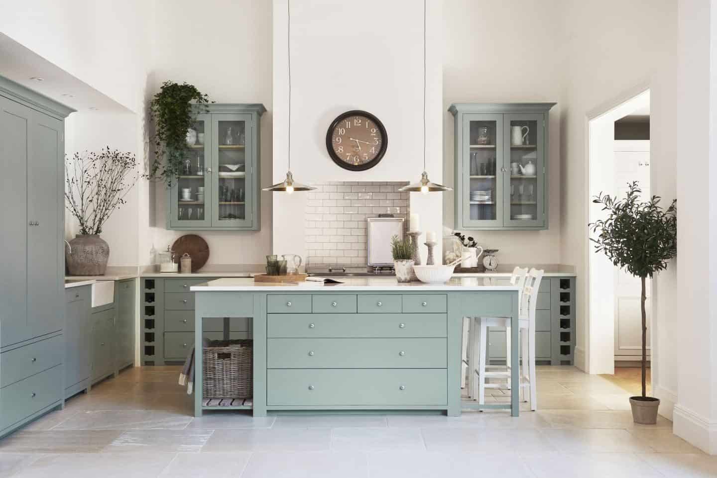
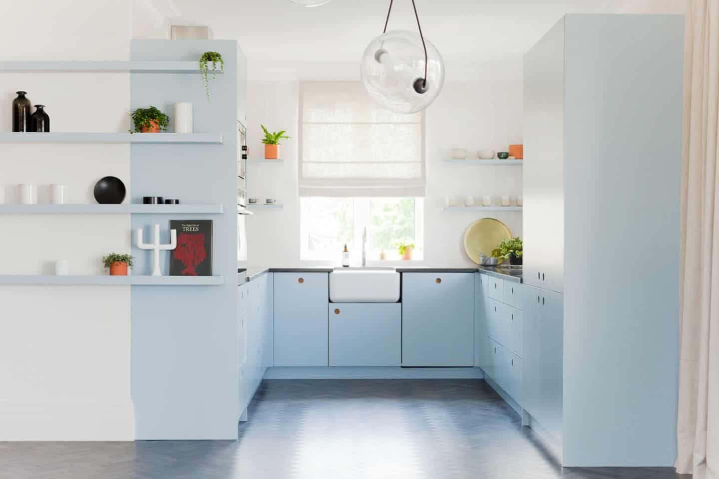
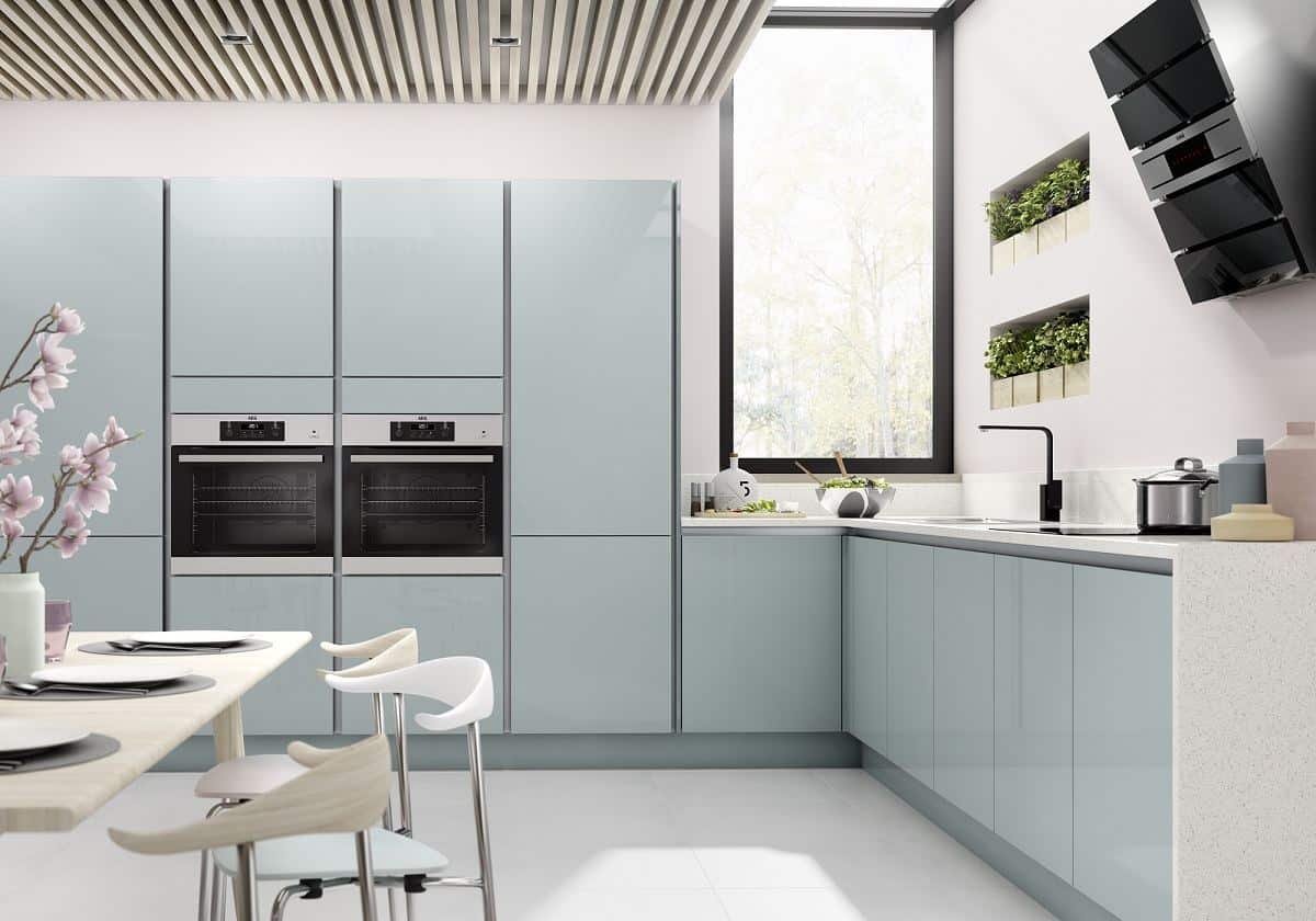
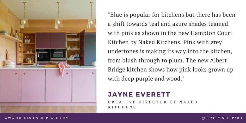
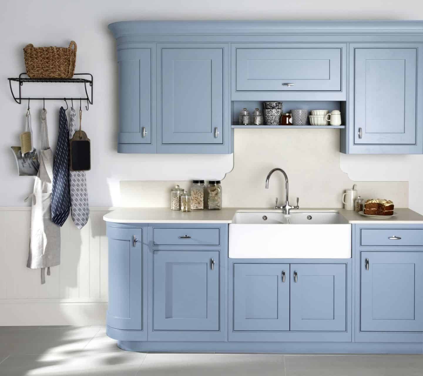
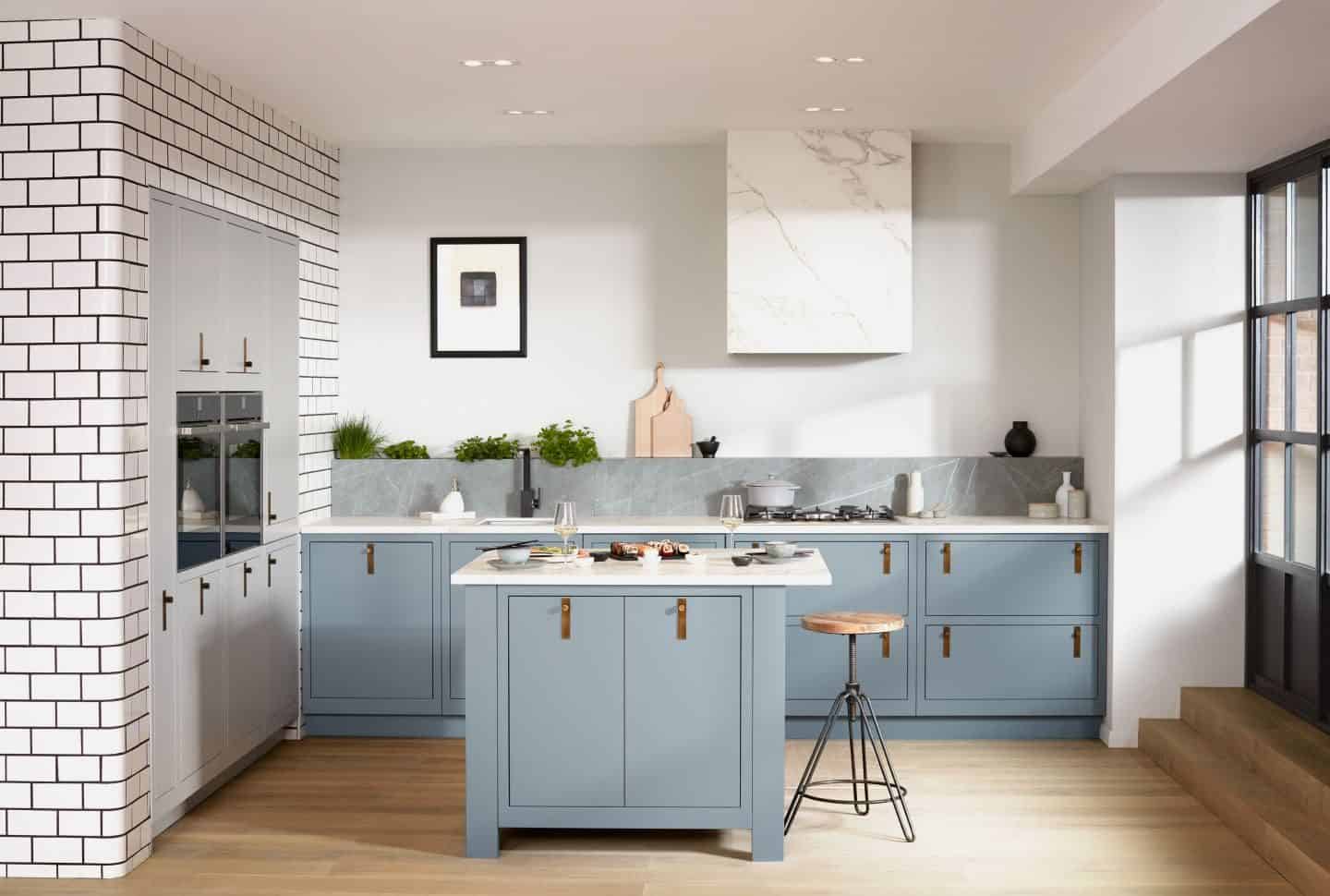
Pale neutrals are also starting to grow in popularity and we are seeing a more neutral and holistic palette for the kitchen. These candyfloss colours add a fresh, bright and airy feel to the heart of the home. Powder blue is accompanied by sage green, millennial pink, lilac and lemon yellow for an ice-cream palette that can be mixed and matched for a bit of fun or used singularly for added sophistication.
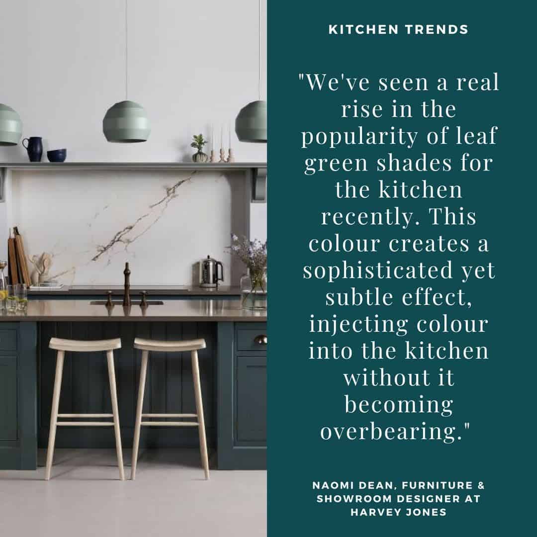
“We’ve seen a real rise in the popularity of leaf green shades for the kitchen recently,” says Naomi Dean, furniture & showroom designer at Harvey Jones. “This colour creates a sophisticated yet subtle effect, injecting colour into the kitchen without it becoming overbearing. We will also see both muted and crisp palettes incorporating soft lilacs, mushroom and periwinkle blues, contrasted with these leaf green shades along with violets and primrose yellows. Consumers are also choosing to introduce colour with smaller items such as vibrant splashbacks and worktops, in addition to painted cupboard doors and accessories such as a cook’s companion.”
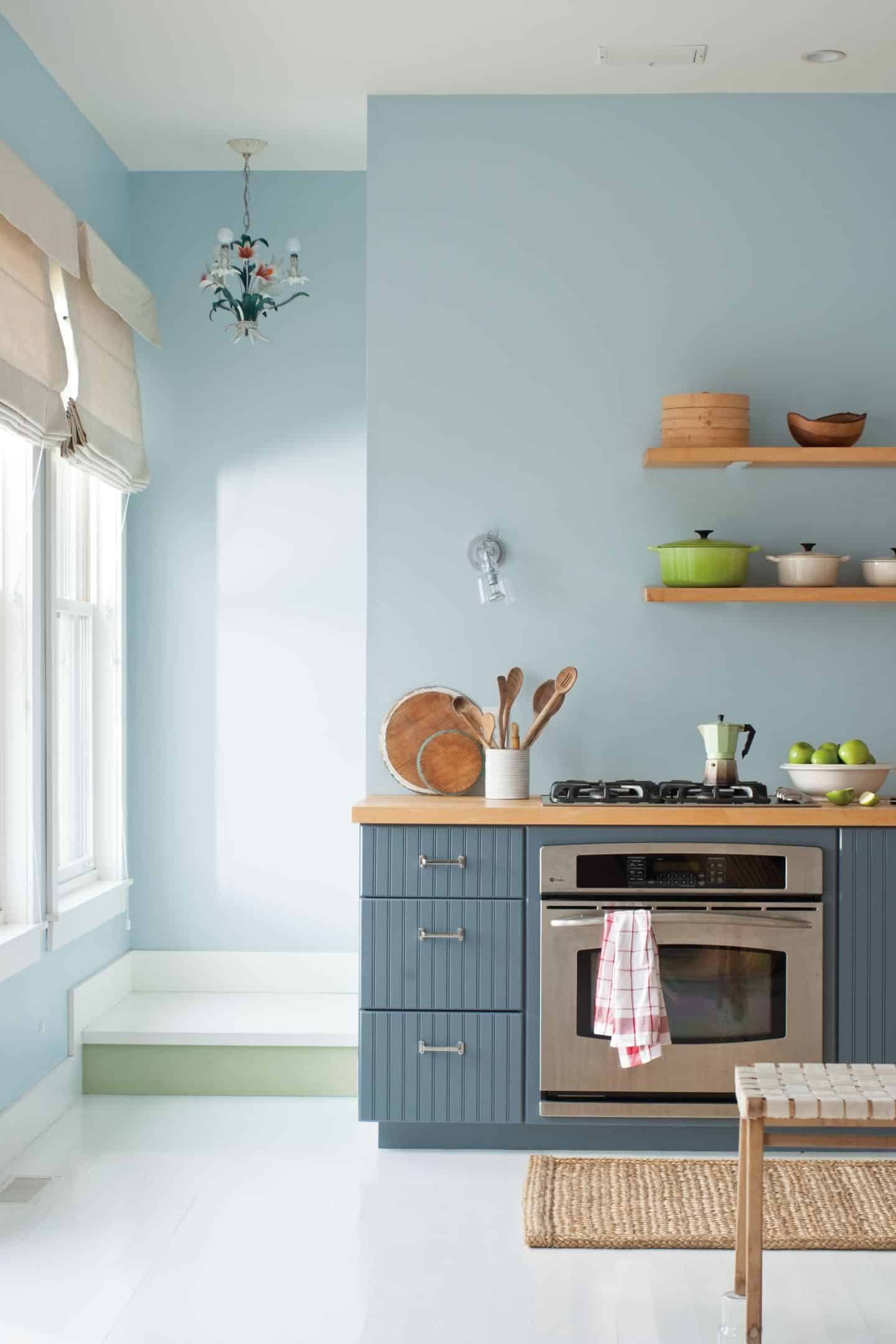
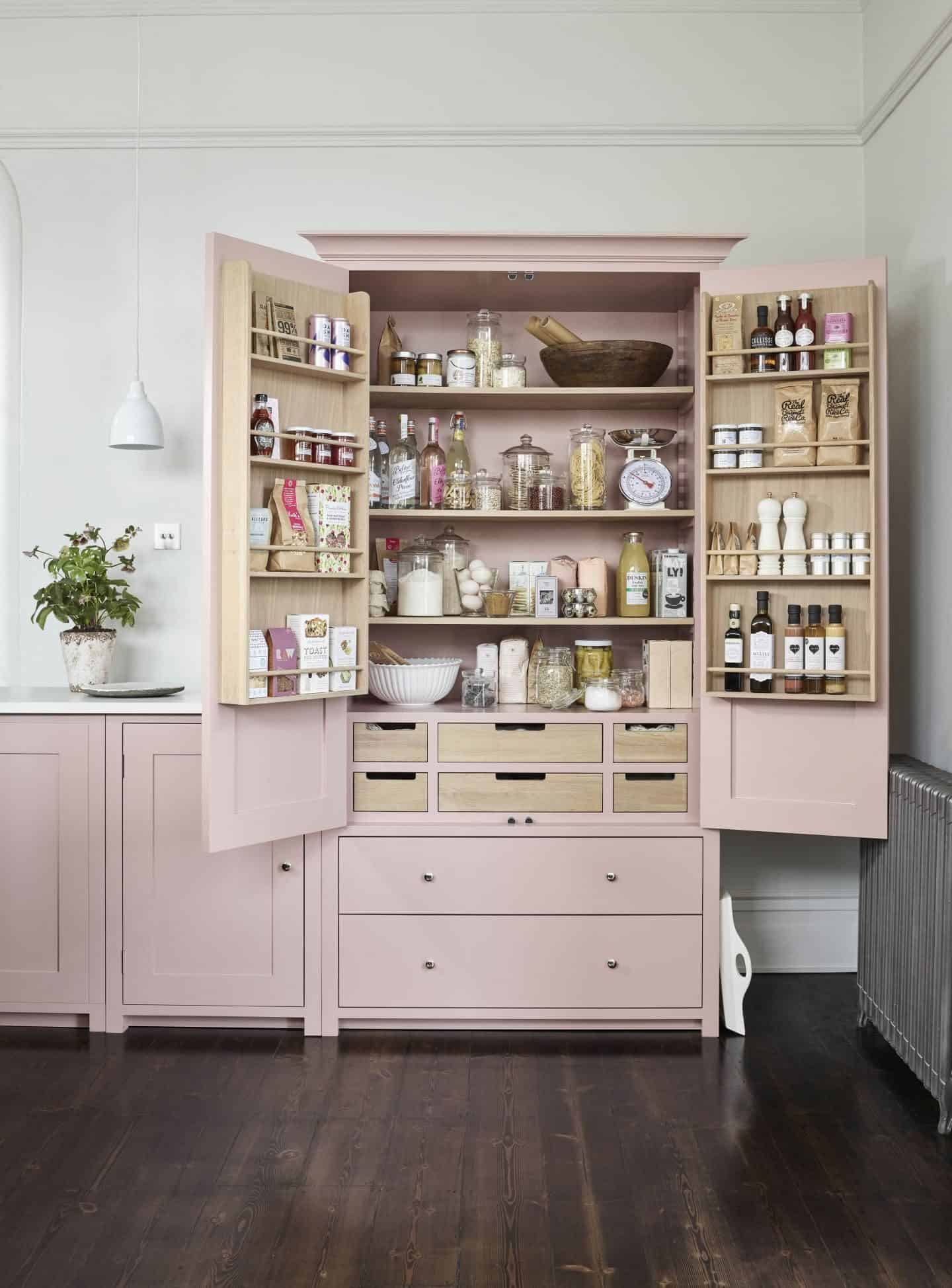
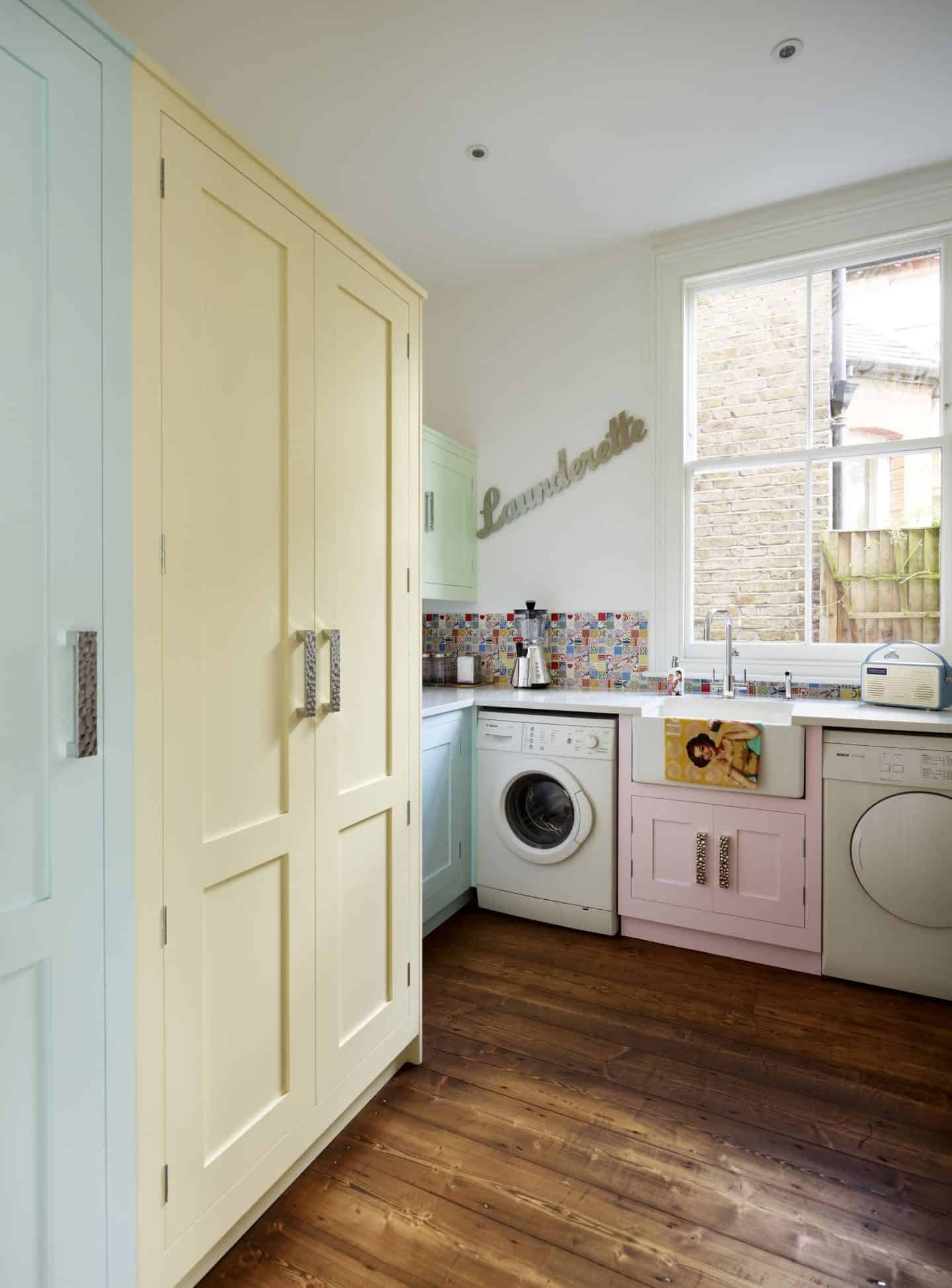
5. Two-tone Kitchen Cabinetry
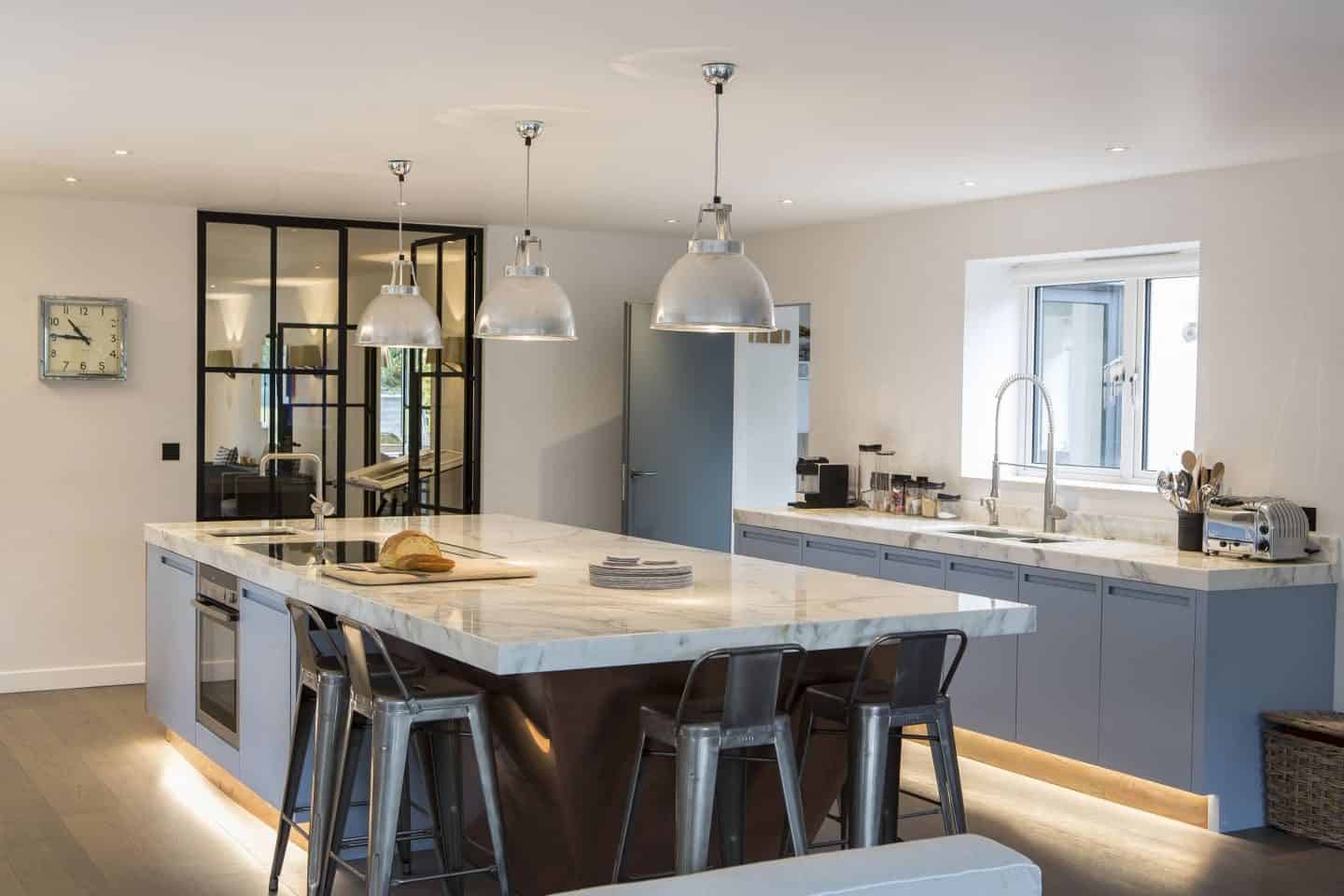
Two-tone kitchen cabinets are the final trend that I wanted to point out. Traditionally, kitchen cabinets have all been one colour but we are increasingly seeing a more playful approach that juxtaposes two colours.
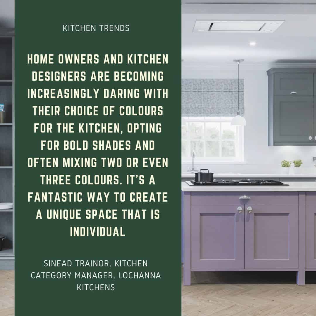
Sinead Trainor, kitchen category manager at LochAnna Kitchens says:
“Mixing colours is incredibly popular. Gone are the days where finishes are the same throughout the kitchen; customers are now mixing gloss doors with woodgrains, and shaker styles with slab doors.”
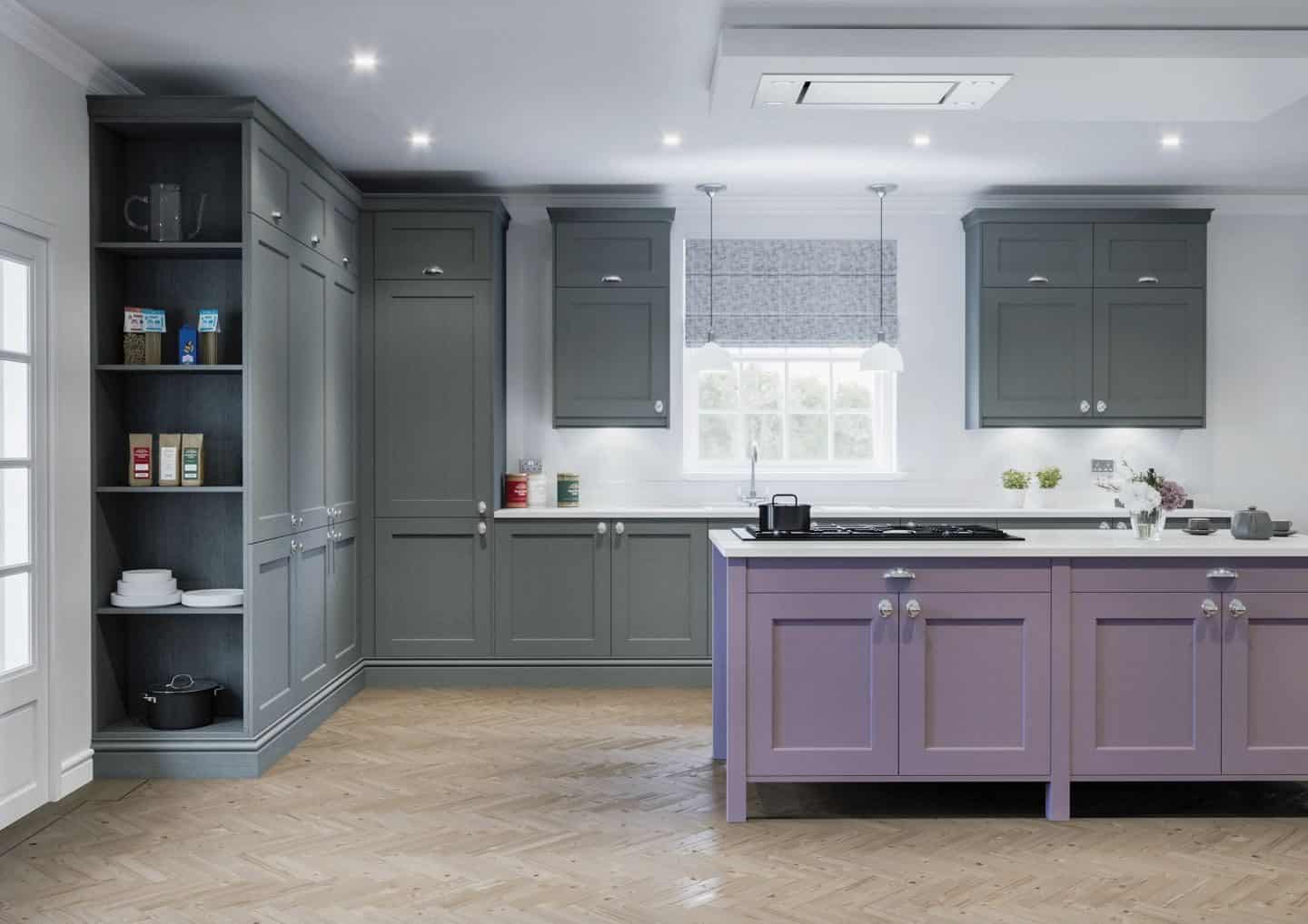
We often see darker lower cabinets with lighter uppers and this is a great option if you are a bit too scared of going all-out dark in the kitchen. By keeping the upper cabinets light you help to retain a sense of brightness in the room at eye level. But we’re also seeing more adventurous kitchens with darker cabinets up top.
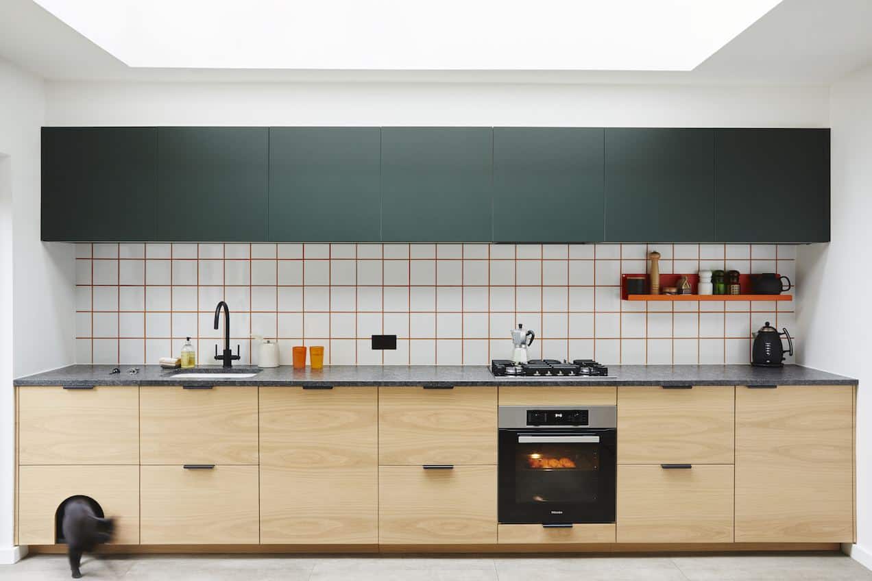
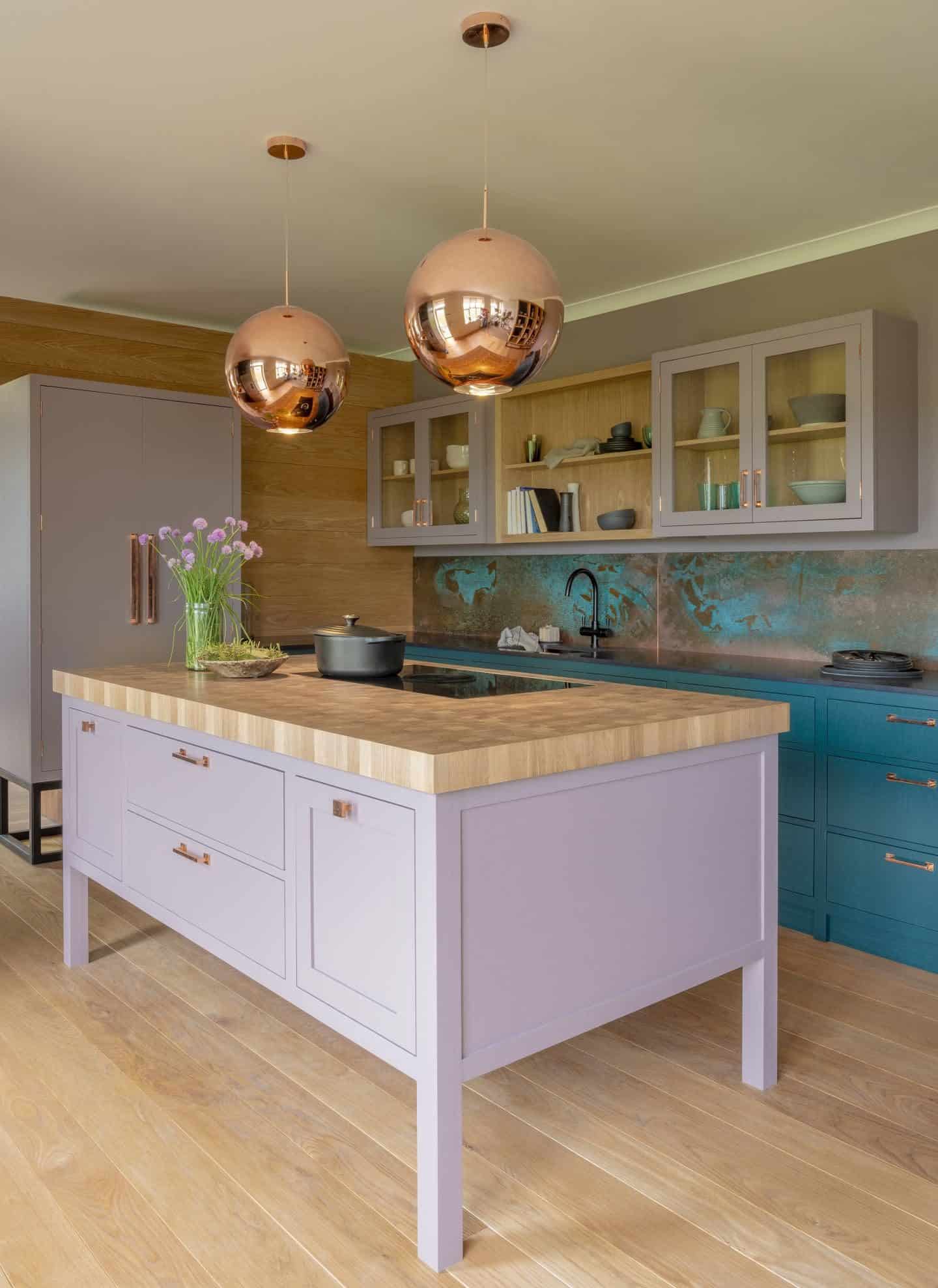
A different take on this trend is installing a contrasting island unit. This allows you to go for the safe option with the majority of your cabinets by choosing white or grey perhaps, whilst still being able to create an exciting statement in the middle of the room by using a bold colour pop on the island.
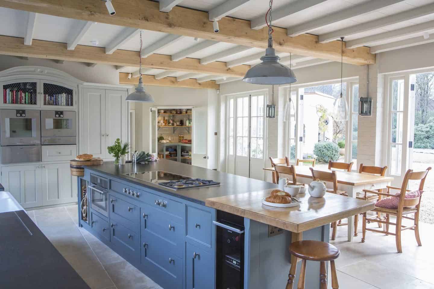
“More and more, we are seeing requests for statement island counters, ” says Tom Howley, Creative Design Director of Tom Howley. “The island counter is an integral part of approximately 80% of our client’s kitchens, but our discerning market is becoming much more imaginative and explorative with colour when it comes to cabinetry.
“Many opt for neutral surfaces, pantries and wall cabinets, which they pair with a brave tone such as a deep blue or forest green on the island counter. This gives the kitchen a more contemporary feel, without overpowering the whole space. This is set to be a popular kitchen trend in 2018: a classic and simple statement, letting homeowners express themselves through intelligent use of colour.”
So, guys, that’s my round-up of the trend for colourful kitchen cabinetry. What do you think? Had you noticed these colours becoming more popular? Would you consider a navy, moss green or purple kitchen in your home? Or what about two-one cabinetry or pastel colours? I’d love to know your thoughts so please leave a comment below. And don’t forget to pin this post for later!

Fantastic kitchen inspiration!
Lovely inspirations here, thank you. And we love that you featured fellow Lewes-based makers Inglis Hall!
Ok I think I’m going to have to have more than one kitchen now… so many beautiful ideas here!
There are just so many beautiful options, aren’t there?
those are really fantastic my dream is to have green kitchen – dark green that is
Me too Pati, dark green with the brass accents is just dreamy. My kitchen is too small for such a dark colour though sadly!
Yes yes YES!!!!! I was initially drawn to dark blue for our kitchen but realised dark green with copper is more unique and more me. I love colour in kitchen – can’t stand the blandness. Def sharing this to inspire others!
Ah thanks Dona, please share away! Dark green with copper will be amazing. I’ve gone with that for my living room and it works so well!!!
Such an inspiration Stacey, as I’m finalising my own kitchen refurb. I particularly love the green, something I never thought I’d hear myself say!
Thanks Nicola! I’m nuts about green too. My living room is dark green and I adore it. it’s so calming and soothing!
Wow so many gorgeous options you’ve included, such an insightful post. I have to say I’m not a fan of the purple and I’m not sure why. I think it’s about time more colour was embraced in the kitchen rather than just white or maybe a taupe or grey. Especially as there are so many options out there.
I agree Mary. There is no need for kitchens to be so boring and clinical.
What a lot of lovely kitchen inspo! I’ve been wanting to paint my wooden kitchen cupboards for ages but am really struggling to pick a shade. I feel like I may have missed the boat on the deep inky blues, but am not 100% about the lilacs, although they look lovely in the examples. It’s such a big job to embark on that I want to get it right. The cactus colour above is nice I have to say though! X
I think navy will be quite timeless and will date less than the green. But then it’s all about which colours resonate with you more. I’d go for green in a heartbeat. I find that it grounds me so much!
Love the new look of your blog Stacey and this post was so inspirational! Loved how you organised all your photos/sections by colour and added industry commentary! I hope it does fantastic for you on Pinterest! I’ll definitely share this with my audience!
Thanks Jenny, share away! I always appreciate people spreading the word!
An amazing comprehensive post and so much fantastic kitchen inspiration! I’m planning for my kitchen to be black but now you’re making me feel boring! Haha! I have adored that dark green deVOL kitchen for ages but I have to say that some of the paler colours in lilac and pink really do look spectacular as well. Loving this trend towards colours, it’s nice to see something a bit different! xx
It’s a big step for kitchens actually. It might be a bit too far outside of the comfort zone for many people admittedly, but as long as you choose a colour you love and not because it’s a trend, it should be a safe option. I also love black kitchens and I can’t wait to see what you do with yours!
I love the idea of a bold kitchen cabinet but I guess it’s choosing the right colour to commit to that is the issue – there are too many gorgeous designs out there! This is a great inspo article Stacey, so many gorgeous images to pin here x
It is a difficult choice Kate and one I’m glad I’m not having to make. I was totally boring when we did our kitchen makeover and added white cabinets!
Fantastic post and a great selection of inspiring colourful kitchens! I love a good dash of colour and some of these kitchens are perfect.
So many perfect kitchens Rachel, just don’t ask me to choose my favourite one!
Brilliant Stacey – what a comprehensive report. I am fascinated to see the variety of colours and great kitchens that you have featured. Personally I love the deep blues and forest greens. It will be interesting to see which colours will become popular and take over from Grey.
Thanks Lin! I’m also looking forward to seeing how these trends develop.
SO much kitchen envy! We’re going to do a massive kitchen overhaul in the next year or so and I have my heart 100% set on a navy kitchen set. Let’s see if I’ll still feel the same when the time comes!
Oh lovely Karen. I hope you do go for navy! I’d love to see that!
Love navy kitchens! I fear mine is too small for bold colours, but one day I’d love one like these!
Same Sam, that’s why I went for white and I think it was probably the best choice even though I love this green and blue kitchens!
What a fantastic round up!! This must have taken ages to put together Stacey!
Going to send this a couple of my clients now….
Oh thank you so much Karen! Yes it was a whole lot of work but I enjoyed it so much!! I’m definitely going to start working on more posts like this moving forward.
Gosh some of these are stunning! I think navy will have the longevity and I’m partial to the green too
I have total kitchen envy Susan. My monochromatic kitchen looks severely lacking in personality now and extremely unadventurous!
SO many gorgeous kitchens!!! The green one by deVOL keeps popping up everywhere and it’s sooo gorgeous! I think I’ll bookmark this post for future reference ;-) xo
I just love everything by deVOL Carole! Their kitchens are total kitchen goals!!!
Waou. The colours are so beautiful! I totally agree that in general people play it safe with kitchen colours and that is changing. It is a bit more stimulating than plain or neutral wood. Even though my kitchen is grey and black and I love it, i can’t resist to the charm of a soft blue kitchen.
Agree Marlene, I find those powder blue kitchens extremely soothing. And that shade of blue is a lot less scary than the navy or purple for those who fear colour!