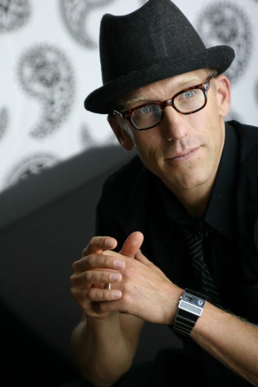
I first discovered Lars Contzen back in December 2008 when I interviewed him for Designer magazine. You can read that interview here and find out all about how he uses colour, pattern and form in his surface designs.
Anyway, earlier this year I noticed that he was again involved in some very exciting new projects, this time all about colour which I knew would be of great interest to readers of Designer (and my blog) and anyone who is interested in interior design and colour.
My second interview with Lars was the cover story of the June issue of Designer and you can read the full article in digital format by clicking on the cover below:
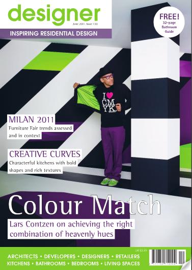
However, here on the blog I am featuring the interview in Q&A format. I hope you enjoy it and please do let me know in the comments below what you think about Lars and his work.
What was it about interiors that convinced you that this was the correct direction for you to take?
I started my graphic work for interior design products 12 years ago with the perception that people will be influenced by cultural and “subcultural” currents. In my opinion, in the last decade we have experienced one of the biggest cultural shifts ever. We have changed from an analogue to a digital culture.
Our spirit and communication is affected by the pictures and graphics which we see on our computers from around the world. A very colourful style pluralism was the reaction to the new habits we have adopted from living with computers. For that reason it was very logical for me that colour, graphics and individualism will become an important factor when we create our living spaces.
Your designs encompass a great variety of products ranging from surfaces, wallpaper and flooring to glass, textiles and furniture right through to homewares and entire spaces. Which of these do you enjoy designing the most and why?
I started up with designs for high pressure laminate surfaces and flooring for Resopal and Wilsonart. Later on there comes wallpaper for A.S. Creation and Glass for Glas Troesch as well as furniture pieces for the Hiller Group. These were the basic elements for conceptual room planning.
Last year, we integrated fabrics, carpets and home products into our collection. Every material is very interesting to design with and offers a new challenge, if you want innovative results. The more complexity a material has, the more I like it. That is the reason why I love to design with glass for example. You can combine so many techniques in one product to define the result.
How has your approach to design changed or evolved over the past few years and what have been the main drivers of this change?
At the beginning of my work I concentrated only on colour, shape and graphics. Over the last years it has become more important for me to create new surfaces by experimenting with embossing, using varying degrees of gloss or new material innovations. Designs should not be only striking. I like it when they have also aspects of eternity, a relation to art or when they look precious and unique.
Would you say that recently your attention has changed focus slightly from pattern to colour?
No, not really. For our colourcourage project I concentrate only on colour to show the importance of colour for room conceptions and to give interior designers and consumers a matching range of aesthetic and brilliant colours.
A brand new pattern collection for nearly all product segments will be released in summer this year, in cooperation with my industry partners . This collection can be used in conjunction with our colourcourage plain colour range.
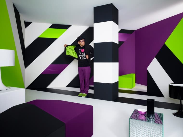
Can you explain what colourcourage is and where the idea came from?
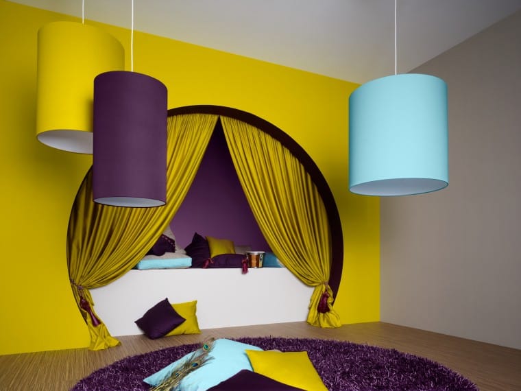
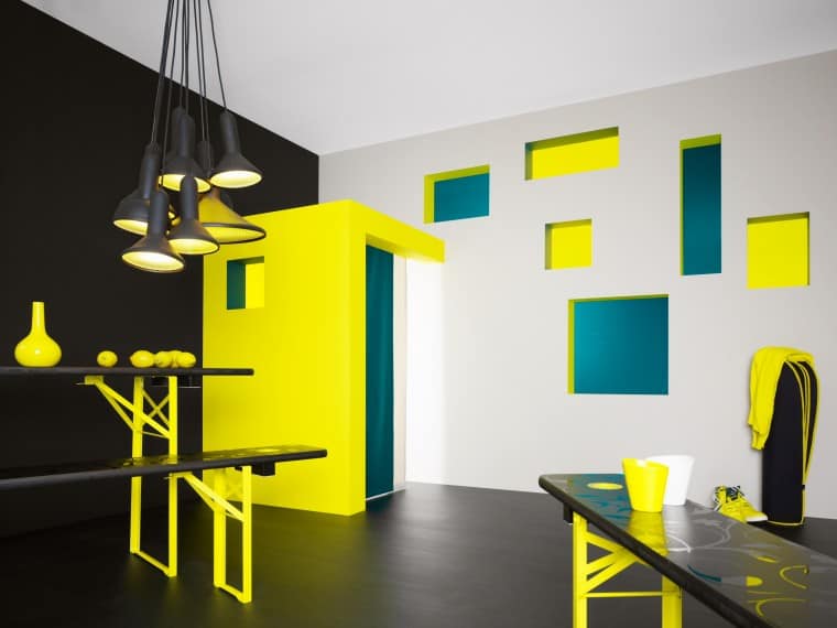
With colourcourage I defined a colour system that includes design patented colour “families” that have been merged into a harmonious and sophisticated use of light and colour. These are defined based on regularities of colour psychology combined with the current cultural understanding of colour and are intended for use in the areas of architecture and interior design.
A colourcourage partner network, consisting of reputed companies in the industry, will supply appropriate products or materials, which guarantee a well-balanced and harmonious colour composition.
The idea is to fill architecture and interior design with striking but aesthetic colour tones so that the look and feel of a room, space or building reminds one of graphic décor or constructivist painting that goes beyond normal dimensions.
A room converted to an “ornament” without the surfaces in it being decorative.
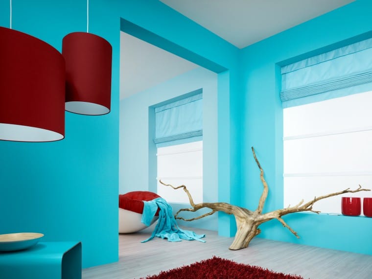
How important is colour in interior design and how important is it to ensure that the colour palettes within a certain space are well-balanced and harmonious?
If you decide to use striking colours for an interior design project it is very important to do it in the right way. The result definitely has an immediate effect on the well-being of the people who use the space. The colours are responsible for the predominant mood and atmosphere in a room. So you bear a lot of responsibility in this decision process.
How important is it for you that the different elements within a space (walls, floors, furniture etc) complement each other and work together?
This is the main concept of my work! I believe that a credible use of pattern and colour must be based on conceptual thinking and a matching system. The more pattern or striking colour tone a material has, the more important is it that it matches with the design elements and materials around it.
Over the past few years, I have worked on the idea of creating a pool of combinable products and materials. If you decide to use “Contzen-designs” for a building you will get offered a toolbox of synchronized products.
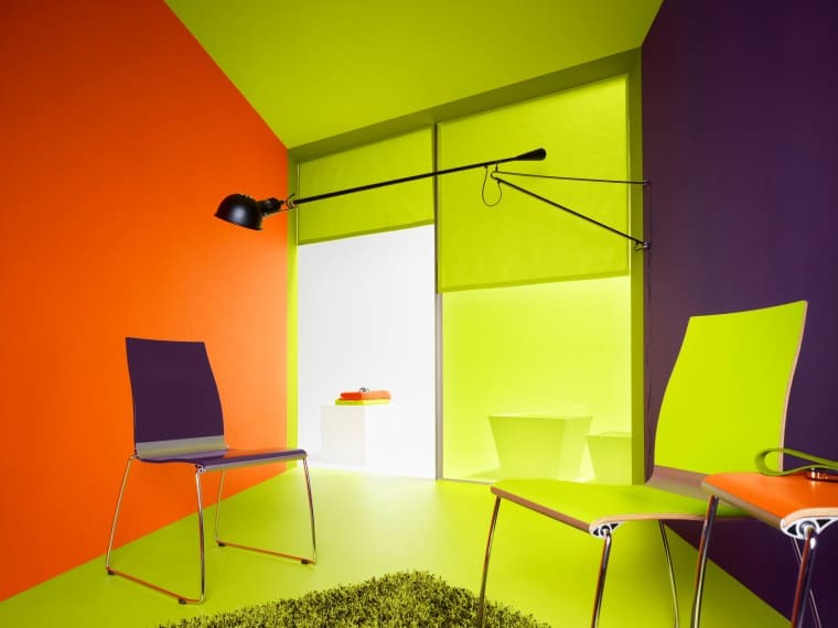
What are you currently working on and what’s next for Lars Contzen?
At the moment we are working with the world leading company of caoutchouc-flooring to develop three progressive products, which will be released this year.
We would also like to complete our spectrum with serial lighting. For that reason we have brought the designer Joerg Obenauer into the contzentrade design studio as a specialist in the area of lighting objects and light installations.
We would also like to design tiles and we are currently looking for the right partner.
