How is it October already? Was last month a blur for anyone else? September is such a hectic month, both in the design world and in the real world. I was so busy last month that my head is now spinning and I’m barely managing to keep up. The kids started pre-school and reception, and my husband has been preparing to start his new job today so it’s all go on the home front. But there have also been a few developments at home that have really changed our daily life for the better.
If you follow me on Twitter you will now know that I am the proud owner of dishwasher. I’ve never had one before and I am not lying when I say that it has transformed my life. I have saved myself so much time and the kitchen is so much tidier and cleaner since we got it. I love it and I finally feel like an adult!
We also recently took delivery of an amazing new bed. It’s an ottoman storage bed from MADE.com (affiliate link) with a beautiful upholstered head board. Again I feel so grown up and having the extra storage that we so desperately need in our little flat is just so helpful! I’ll take some photos soon so you can see!
So all that has been going on at home and in addition I jetted off to Maison & Objet in Paris for the first time. I’ll be sharing my favourite design finds soon on the blog so keep an eye out for that or you can check out my Insta account to see what I was sharing from the show.
Last month was also London Design Festival. I didn’t make it to that as I simply couldn’t justify more time away from the kids. But from what I saw on social media it looked like another cracking design event.
And September also marked that time of year when paint brand Dulux announced it’s colour of the year for next year. The colour choice is announced at the ColourFutures™ annual trend forecast event, which is now in its 16th year. The event gathers an expert panel of architects, colour designers, design specialists, editors and trend forecasters from around the world to discuss what we need from the spaces around us, capturing a universal theme, and suggesting a colour that suitably embodies the mood of the moment for next year.
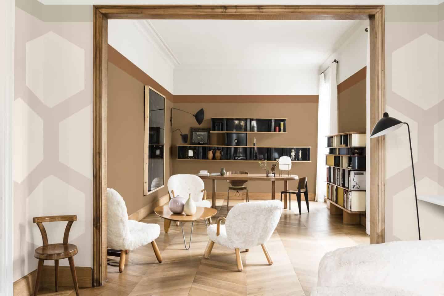
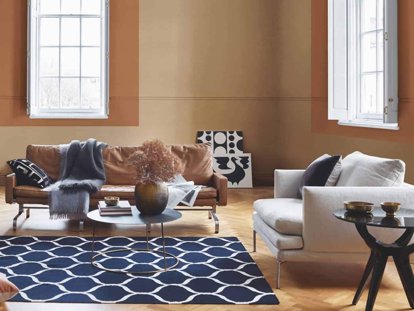
Spiced Honey
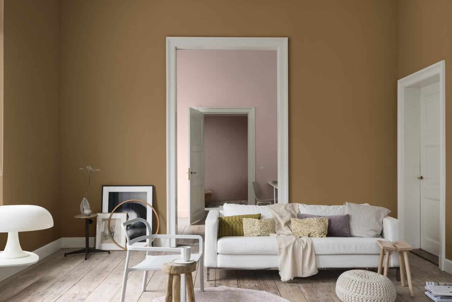
I’m actually pleasantly surprised by the choice for 2019. Spiced Honey is a warm and inviting neutral colour that works well alongside a variety of colour palettes. It was chosen in response to the unsettling and unpredictable atmosphere that characterised 2018 and which prompted us to retreat into spaces where we feel safe and cocooned. However, the ColourFutures™ panel believe that we are now ready to move forward and face the unpredictability with positivity and optimism. (Being British and facing the consequences of Brexit in 2019, I’m not really feeling all that positive about next year, but I guess this is a global trend forecast!)
Heleen van Gent, Head of the Global Aesthetic Centre, who chairs the ColourFutures™ panel each year, says: “Every year, we seek to transform a trend into a colour that responds to consumer needs and enables them to bring a mood, affecting their life, in to their homes.” She says: “The contemporary hue is versatile, sophisticated and timeless and lends itself to a broad spectrum of life and interior styles – perfect for reflecting the universal mood encapsulated by the panel.”
She explains that the amber tones of Spiced Honey can have a dual function. “It can be both calming and nourishing or stimulating and energising, depending on the palettes and light surrounding it.”
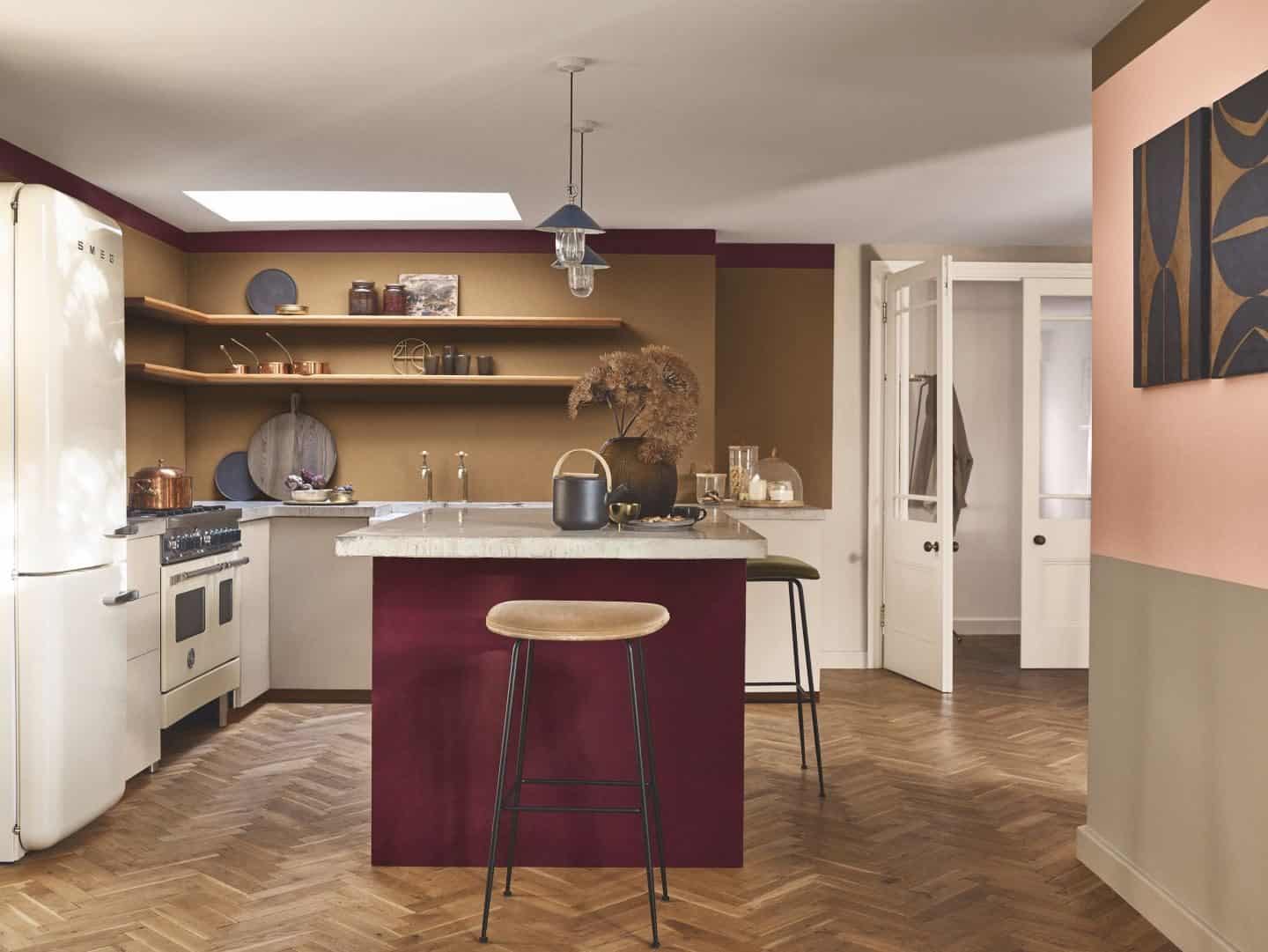
Marianne Shillingford is the Creative Director for the Dulux brand in the UK. She says: “Spiced Honey has a raw, natural quality that works like a warm neutral, which makes it so adaptable to pairing with different materials and styles of decoration. Its rich caramel tones visually turn up the thermostat a few degrees and so it’s perfect for creating a relaxed cosy atmosphere in places where we like to think, dream, love and act.”
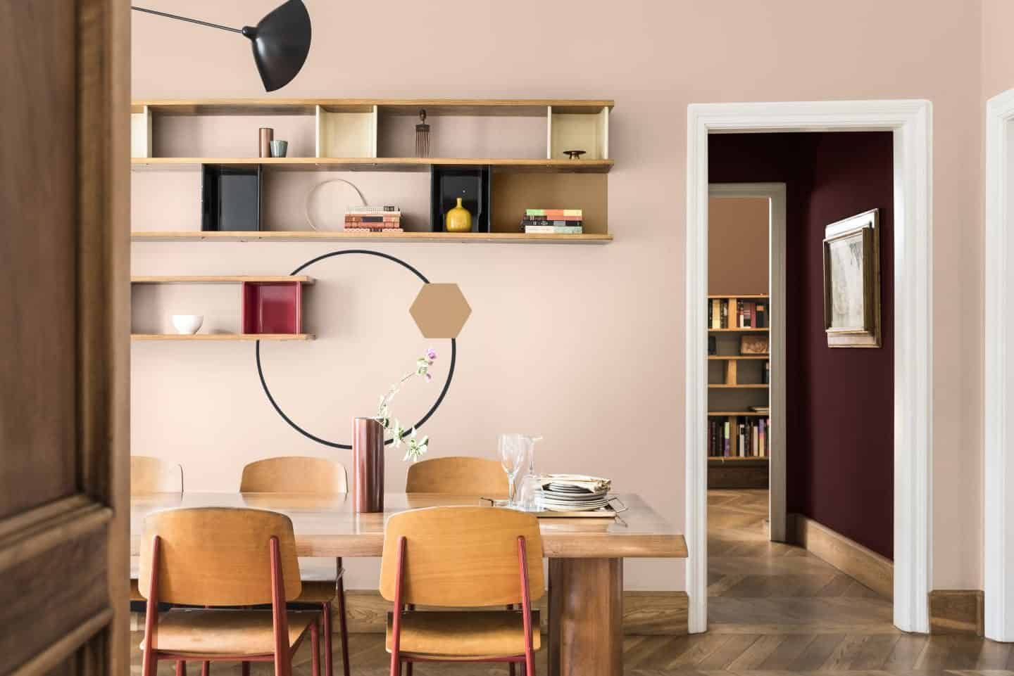
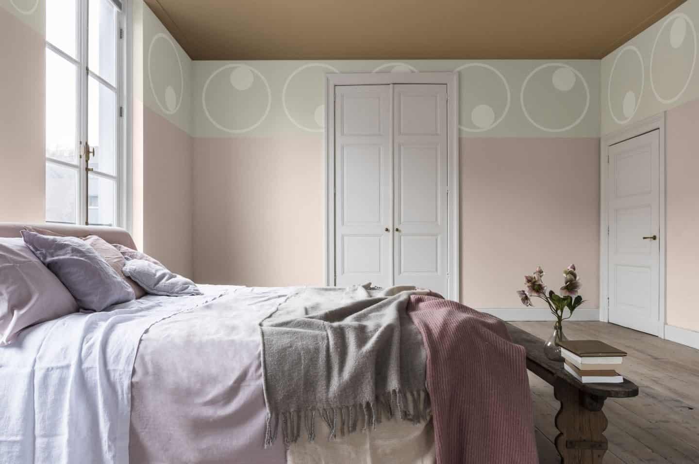
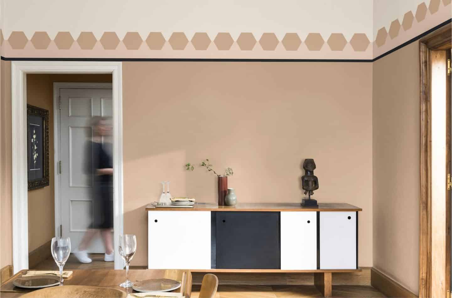
As well as selecting Spiced Honey as Colour of the Year for 2019, the panel also identified a set of colour palettes – Think, Dream, Love and Act – that work beautifully alongside the hero shade and that are also inspired by the mood of the moment. All of the colour palettes include Spiced Honey and have been designed to make it extremely easy to decorate with the colour of the year.
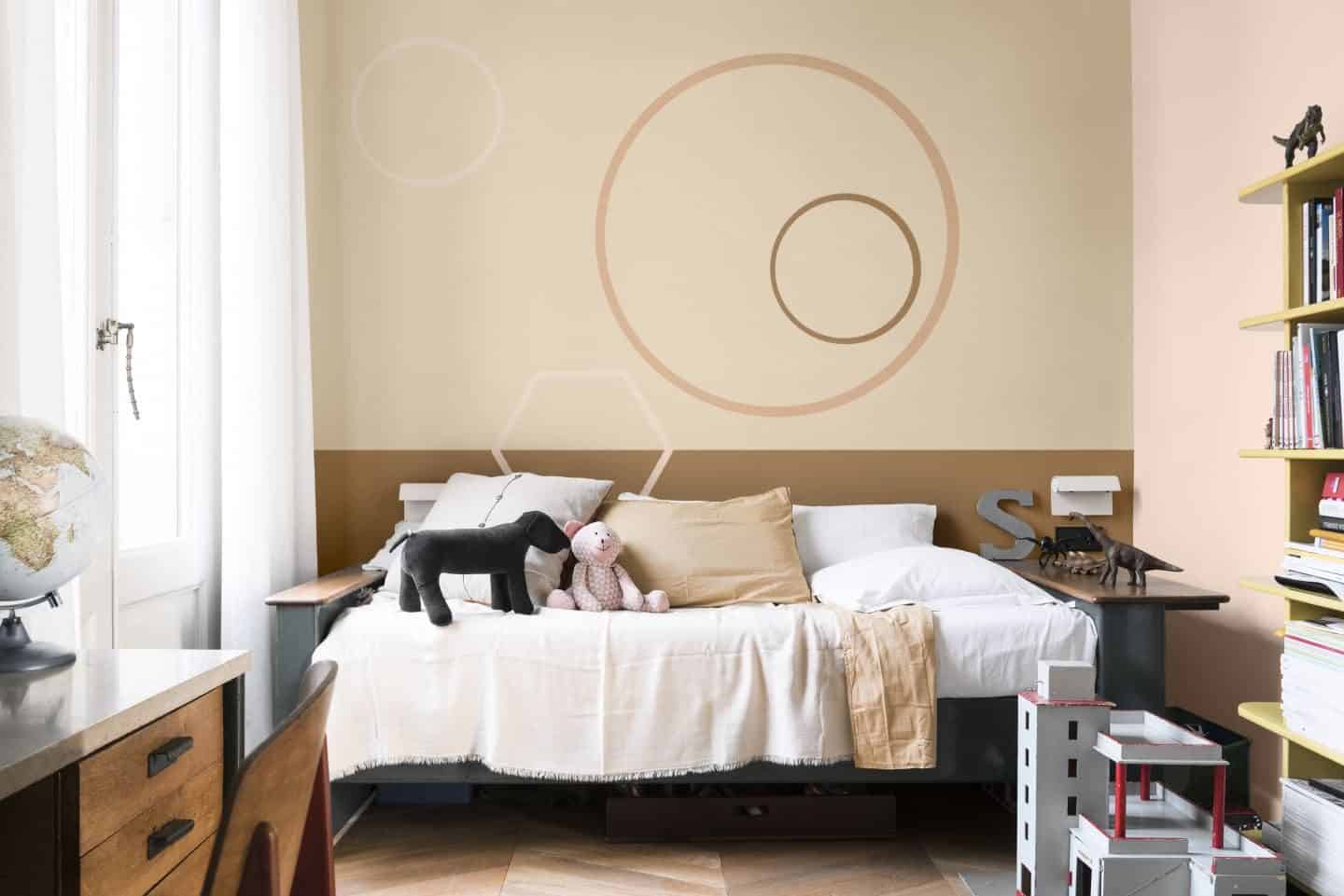
I’m not really a big fan of this warm caramel hue when used on it’s own in large proportions, but I really do like it when paired with some of the other shades in the colour palettes such as the berry shades, the dark blue and the light pink.
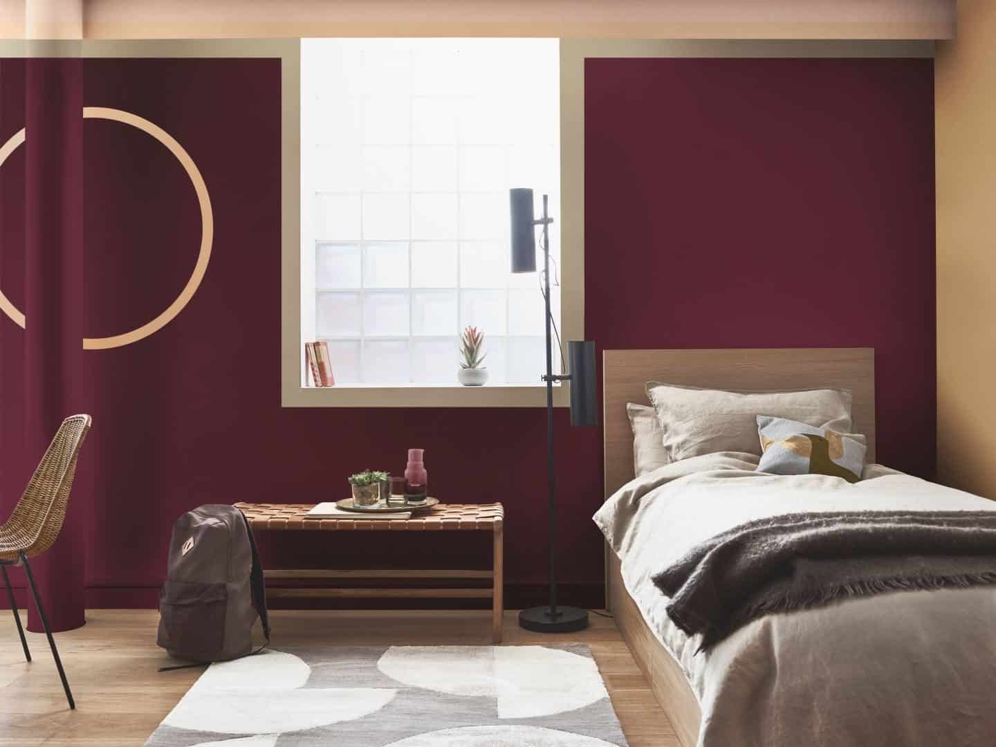
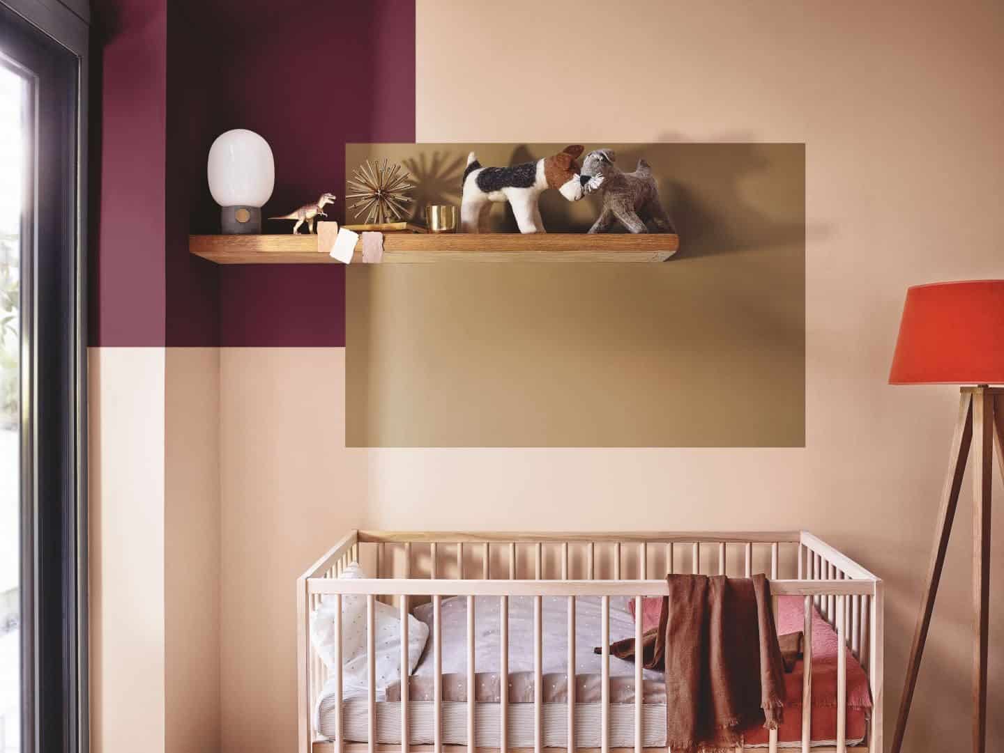
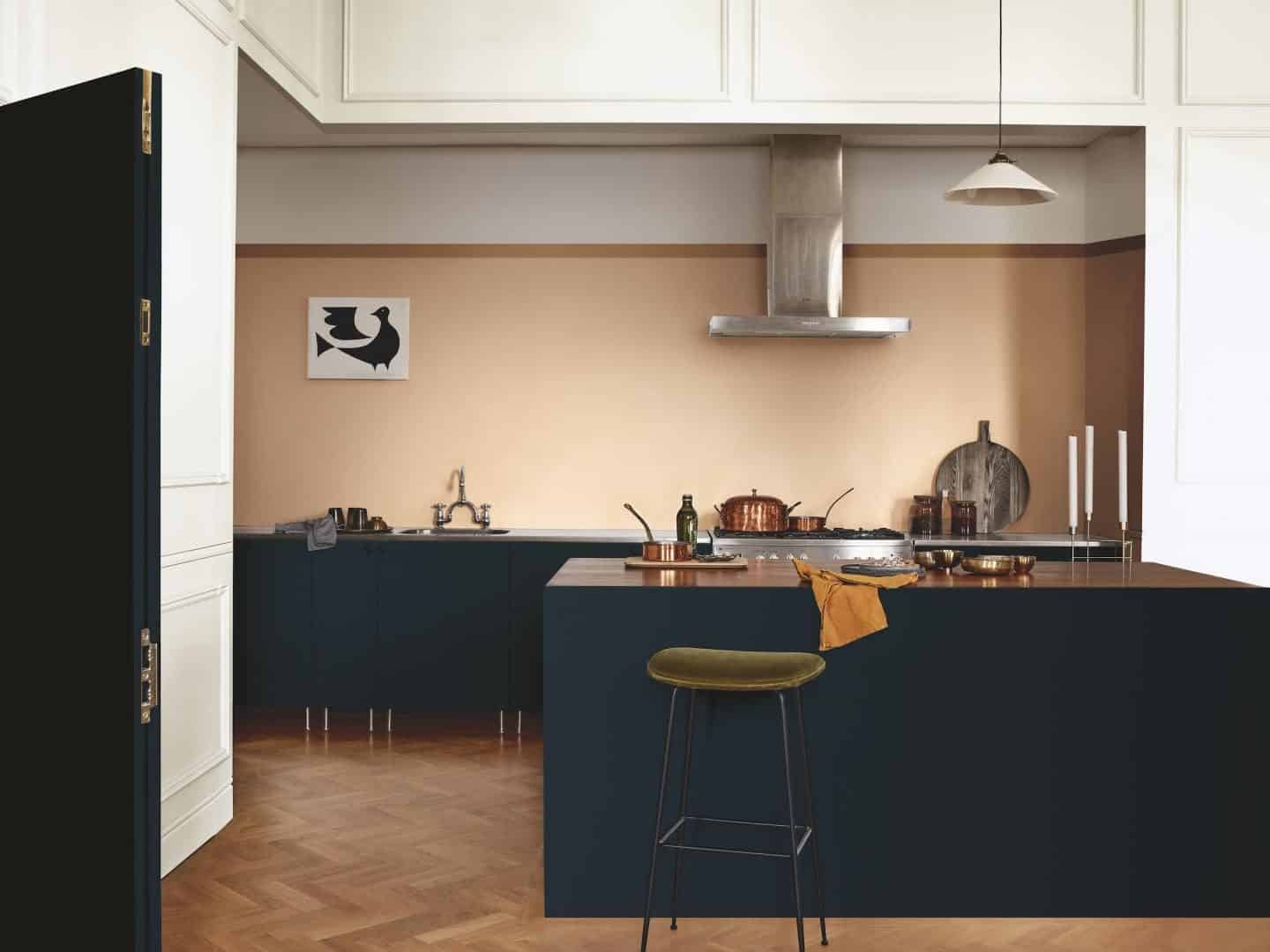
I love an opportunity to practice putting together a mood board, so I’ve created my vision of how I would use Spiced Honey. What do you think?
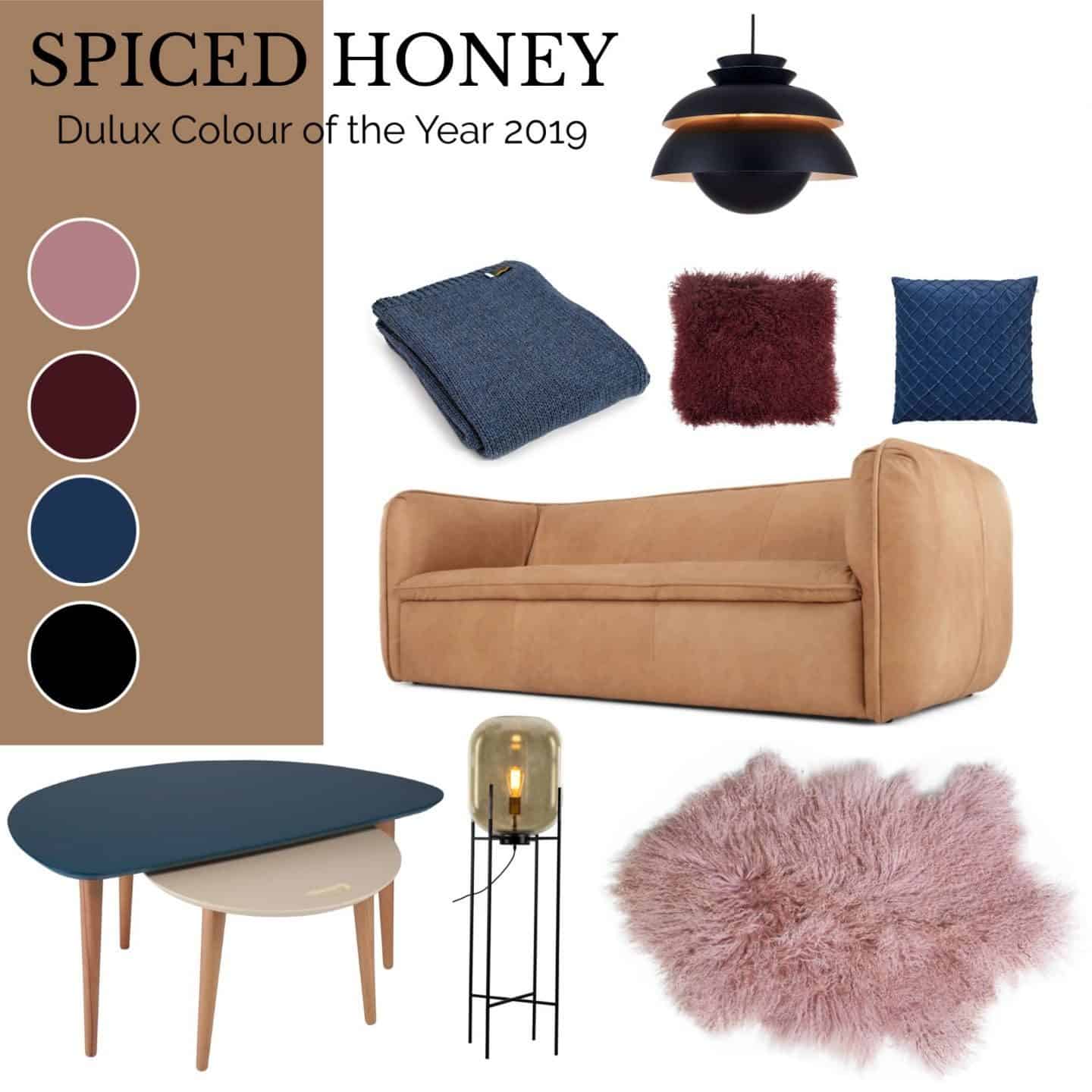
SOURCE LIST
*Products marked with an asterisk are affiliate links*
Berko Sofa from Made.com*
Kasa Metal Dome Pendant Light from Cult Living
Tweedmill Knitted Alpaca Mix Throw in Blue Slate from Black by Design
Luxury Tibetan Sheepskin Cushion in Burgundy from Audenza
Deva Blue Velvet Cushion Cover from Vênoor Living
Luxury Tibetan Sheepskin Rug in Rosa from Audenza
Eden Gold Glass Shade on Stand Floor Lamp from Alexander & Pearl
PX Coffee Table in Petrol Blue & Cream from Einrichten Design

Wow , such a great color “Spiced Honey”.
Looking really nice on the walls. Using some dark colors alongwith like navy blue,dark red ,steel grey will add a plus to the beaty of home.
I was surprised by the choice of colour this year, but I like it. Depending how it’s used, it can be a very ‘liveable’ with colour.
Congratulations on the dishwasher and the new job for hubby! Sorry but no, being a teenager in the 70’s I had my fill of brown and so sadly spiced honey is not for me.
I’m with you. I prefer it when paired with darker shades or that subtle pink. Have to agree it would certainly ‘warm’ up a room. Looking forward to seeing how it gets used in the real world too. x