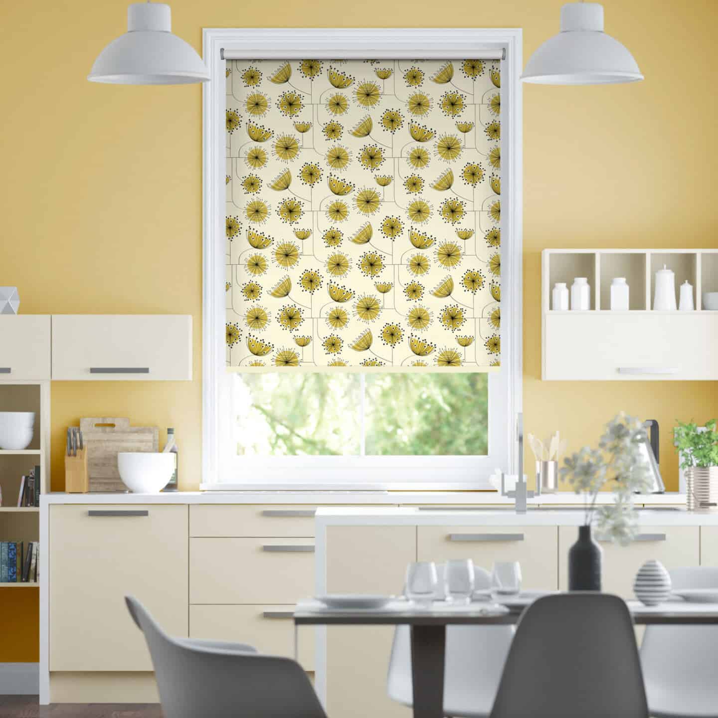
Dandelion Mobile Sunflower Yellow roller blind by MissPrint from Blinds2Go
I’m not really one to follow trends, I tend to stick with what I like and what appeals to me on a personal level rather than following fashion. However, just sometimes there are a few trends that come along and I can’t help but get caught up in the furore. And this is exactly what has happened to me recently with yellow.
I’ve never really liked yellow, and in fact I would even go so far as to say it was my least favourite colour. That is until a few months ago when I suddenly developed a really strong love for this bright and vibrant hue. So I started to ask myself what exactly it was that made me discover my new love for yellow.
Luckily for me this is where colour expert and consultant Karen Haller stepped in to offer me her insights into the new-found popularity of yellow. Here she answers my questions and gives us her tips and advice on how to make the most of this sunny colour and how to use it to its maximum potential in interiors.
Why is colour so important in interior design?
KH. Colour affects us physiologically, therefore we cannot underestimate the powerful effect a colour or combination of colours used will have on those who use the space.
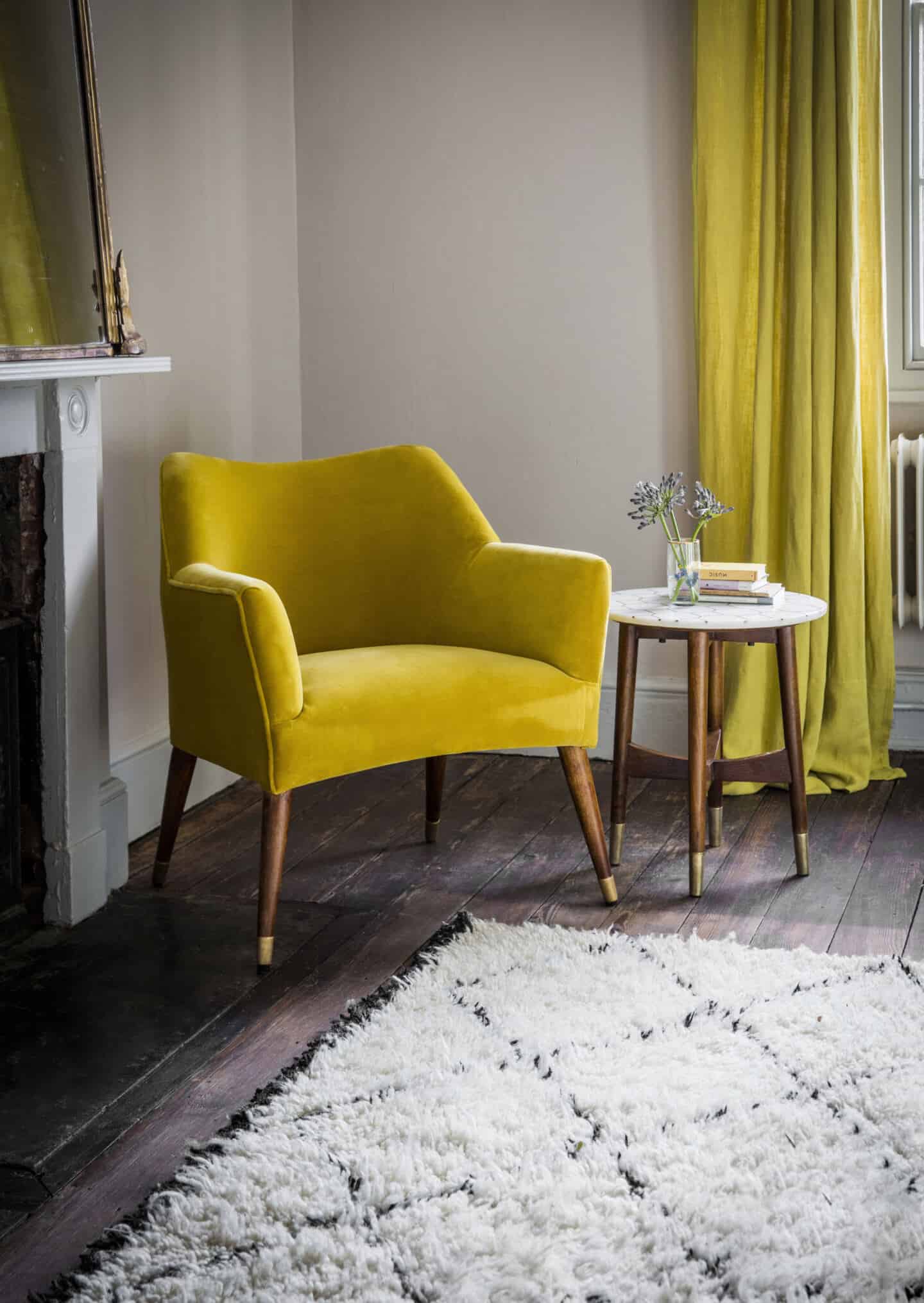
Astoria Armchair In Mustard Yellow Velvet from Atkin & Thyme
We are seeing more and more people using yellow in interiors this year. Why do you think that is?
KH. The trend colours we see today are retrospective, a reaction to influencing factors two to three years prior. So if we think of what was happening two or three years ago, we saw the economy taking a nose dive. Yellow was possibly chosen for its positive psychological qualities: creating happiness, optimism and confidence for the future.
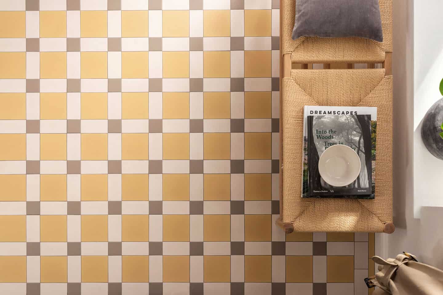
Hawthorn Yellow Dover White and Holkham Dune Victorian Floor Tiles from Original Style in a Brighton Pattern
What are the main psychological properties of the colour yellow?
KH. As with every colour there are positive and negative psychological properties. Positive qualities for yellow are happiness, optimism, confidence. Being surrounded by too much yellow, the wrong yellow for you or the wrong tone in relation to the other tones within the colour scheme and the negative qualities could present themselves such as irrationality, anxiety hence the expression ‘yellow streak’.
How can we best harness the positives effects of using yellow in interiors?
KH. By using the right shade of yellow that resonates with you. Using it in the right proportions and in the right rooms.
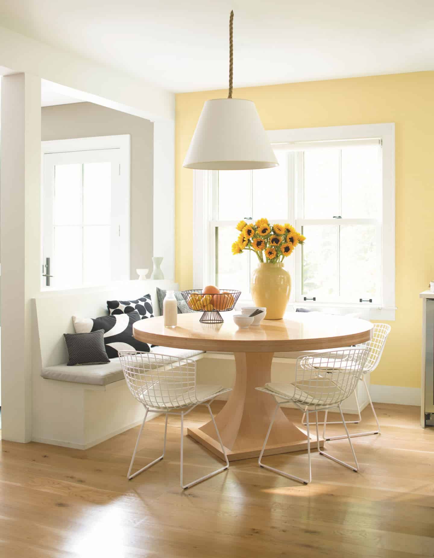
Hawthorne Yellow HC 4 Regal® Select Matte by Benjamin Moore
How important is it to choose the right shade of yellow?
KH. The right shade of yellow will be the one that resonates with you. To pick one that doesn’t will create disharmony with you and the negative psychological properties of yellow may, over time, be felt. Pick the yellow that resonates with you, not because it’s in fashion or because everyone else has it. The colours you pick are an expression of your personality. Yellows range from creams, daffodil and sunflower yellows, through to acid yellows.
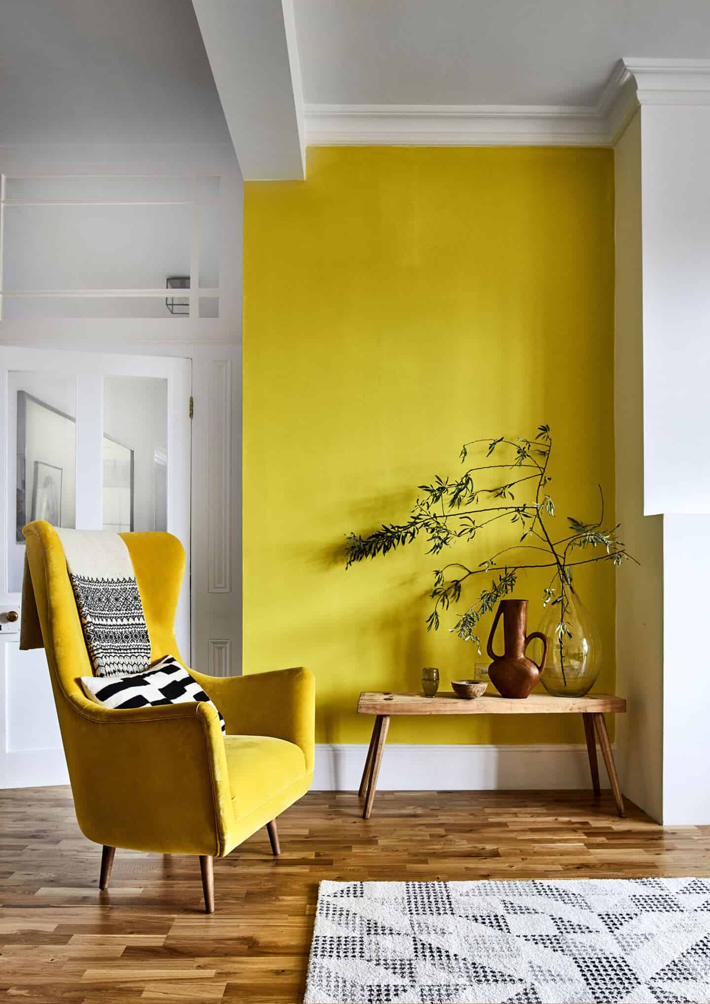
SS19 Kahrs Tres Erve Matt Lacquered Wood Flooring from Carpetright
Are there any rooms in the house that particularly lend themselves to yellow and any where it should be avoided? If so why?
KH. The best rooms in which to use yellow are hallways as these are usually dark and yellow is a welcoming colour and also in the breakfast room to help create a sunny, happy way to start the day.
It is best to avoid using yellow in the bedroom. Yellow being one of thepsychological primaries, relates to the emotions. To sleep in a room that is decorated using yellow will mean that over time you’ll wake up irritable and annoyed. Even when you’re asleep the psychological properties of a colour are still at work! Babies’ frequencies are very sensitive so avoid using cream, which also contains yellow.
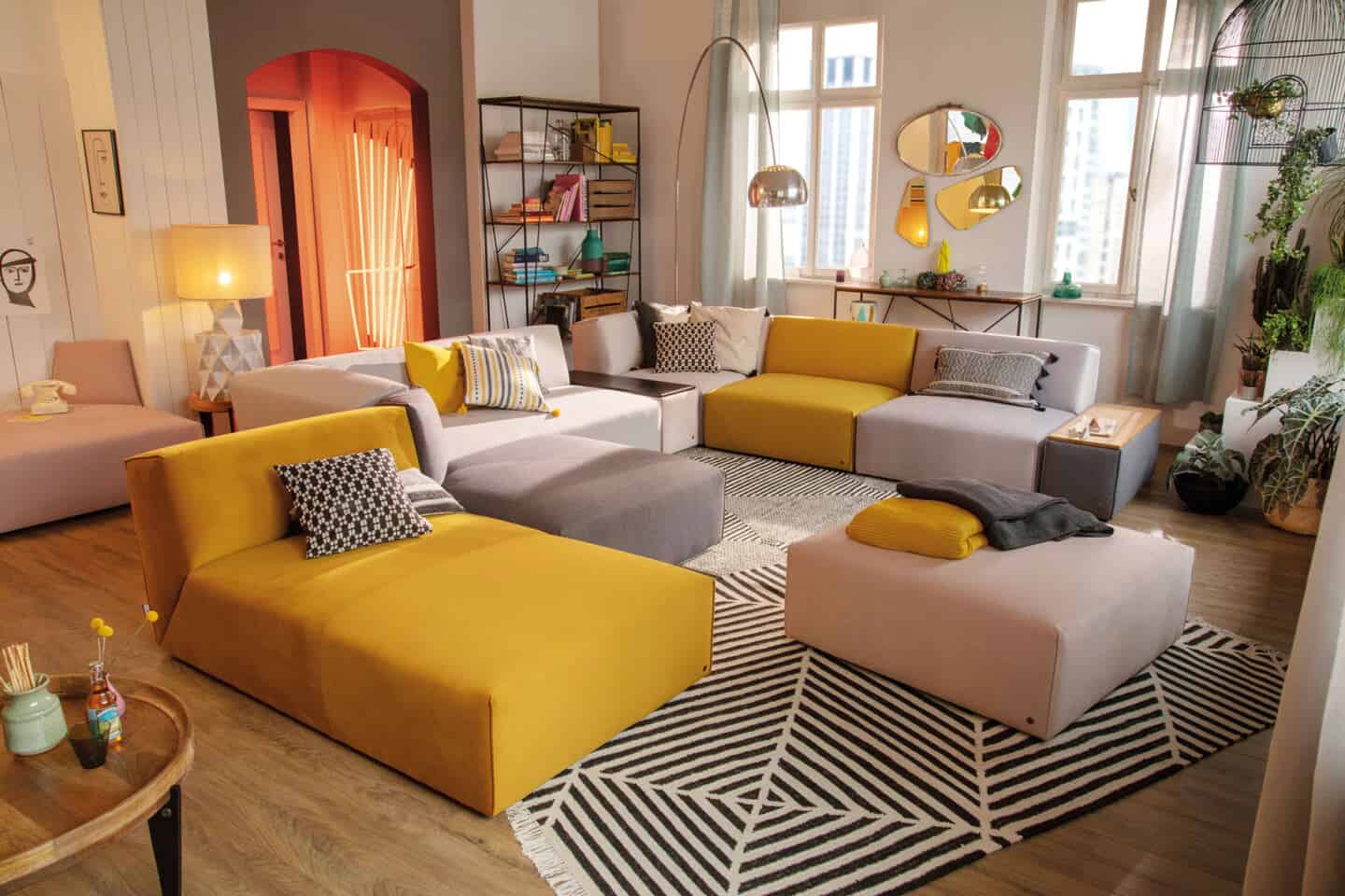
Modulsofa Elements from Tom Tailor Home
In interiors at the moment we are seeing quite a bit of yellow paired with white or grey. Why does this combination work so well? What other colours should yellow be teamed with for best effect?
KH. Pairing colours together can be trend led which I believe is happening with the pairing of grey. Depending on the strength of the yellow perhaps grey is being used to tone the yellow down.
Yellow and its tonal white (cream, white, ivory, oyster) looks fresh, lively, happy. We’ll be seeing a lot of it during Spring.
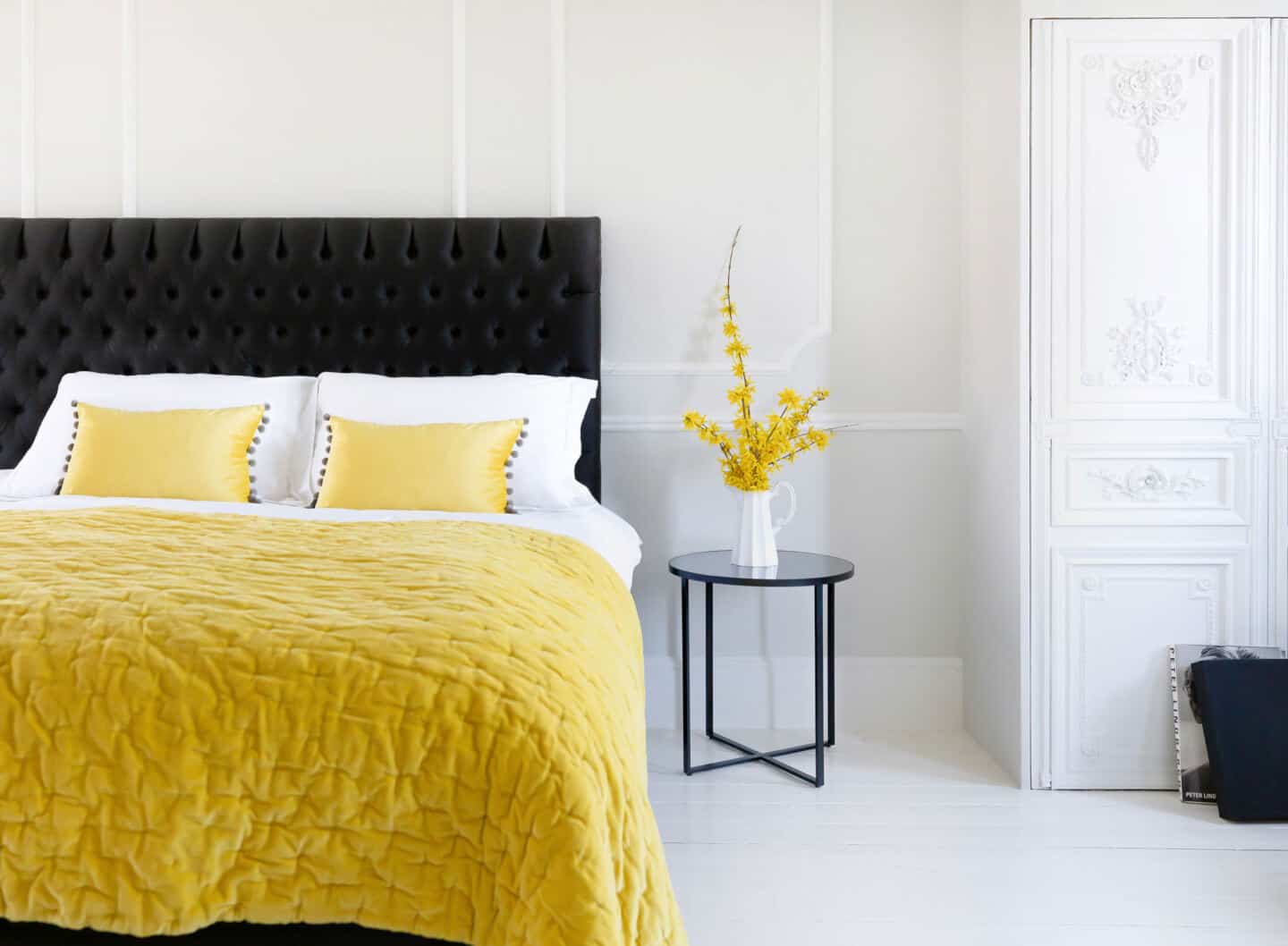
Dove Grey and Yellow Velvet Pom Poms Cushion from the French Bedroom Company
The complementary scheme – yellow and purple. If you find you have used too much yellow in your scheme and you feel a bit overwhelmed you can easily counteract this with the addition of purple. Its psychological properties help to balance those of yellow.
If you’re after a calm scheme, look at using an analogous colour scheme. That is where you use colours that site next to each other on the colour wheel. It is considered calm because there is no strong leap between the colours. For yellow that would be yellow – orange – red. Team this with a neutral e.g with the white from the same colour family (cream, white, ivory, oyster).
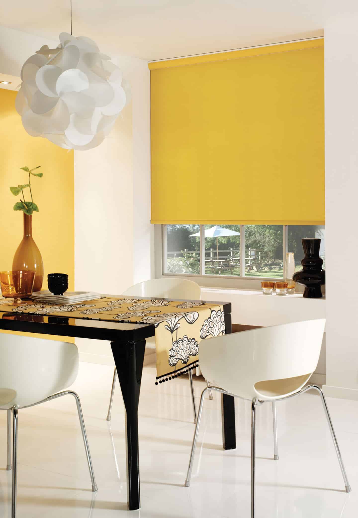
Yellow Blinds Luxury Dining Room Roller Blinds from English Blinds
What are your tips for using colour successfully?
To create a truly harmonious colour scheme use colours from the same colour family.
The key is to use colours in varying proportions. Identify which is your primary colour, secondary and accent colours.
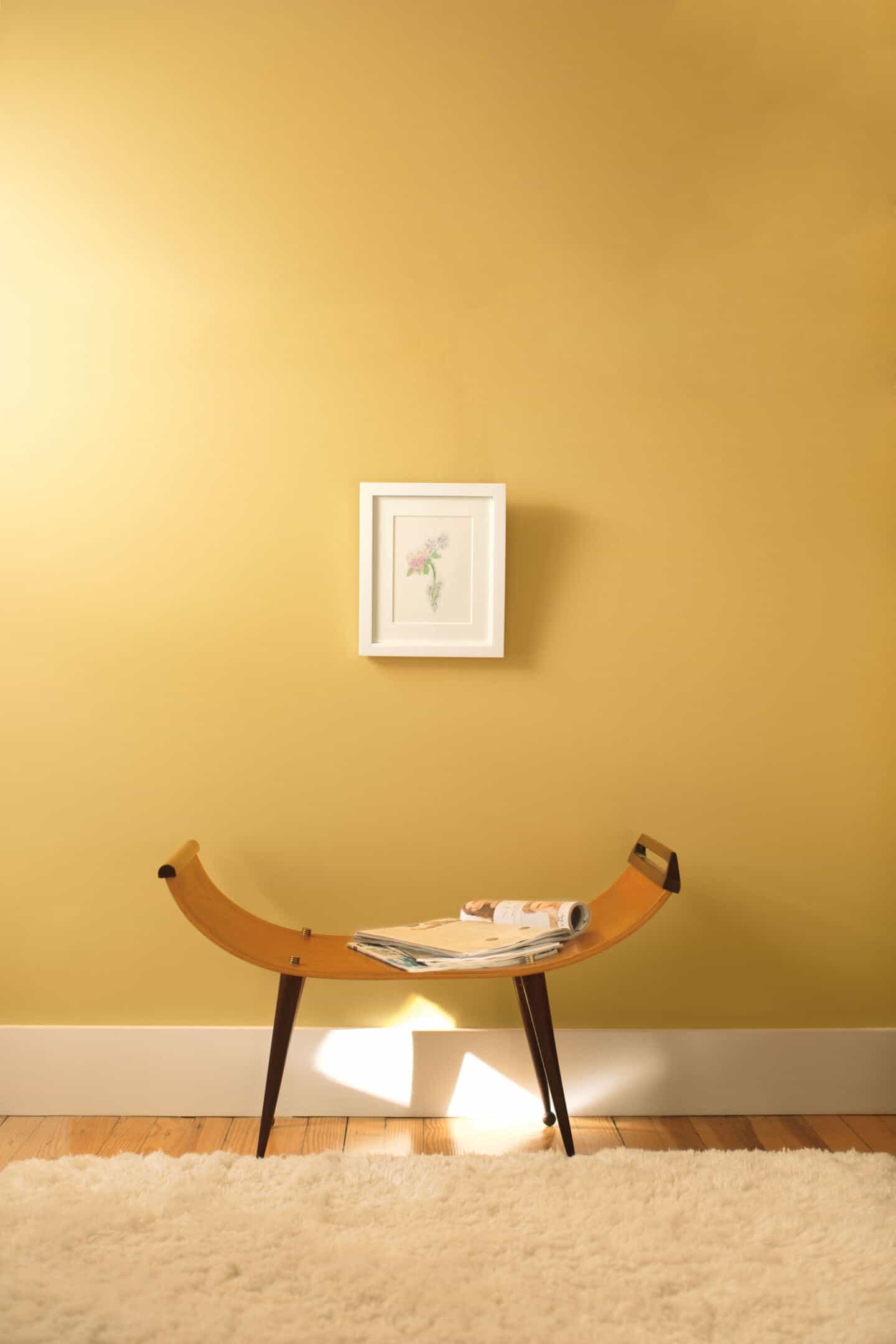
Aura York Harbor Yellow 2154 40 from Benjamin Moore
So how do you feel about using yellow in interiors? Where would you use it? And in combination with which other colours?


I like to use a lot of yellow and blue in my victorian house…yellow is the sun, blue is the sky on a summers day…..i would never use grey….i think use colour or paint it white…col, nottingham England…
very nice keep it up .
Appreciate you helping me to re-evaluate my feelings about what I previously viewed as only a bold, bright or dated color.
I loooove this
I loooove this Im gonna post on insta and share the link in my story! ❤️🙏🏻💯
Share away!!! Thank you!
Love this advice.
x
Fantastic post! I LOVE yellow, and all the images just bring a smile to my face!
Thank you :-)
Stunning post! I think my favorite image is that living room with the day bed. WANT!
Thanks! All these pictures totally made me re-evaluate yellow in the home. It makes me want to get the paintbrush out and decorate.
What an interesting interview. I have been seeing a lot more yellow around now you come to mention it – a couple of years ago I was less keen, but I’m loving it now!
Me too. I think Karen was totally right when she said that the economic situation has had an effect. We all need a bit more positivity and optimism in our lives and our homes and yellow is the perfect colour to provide this.
Hi Stacey,
Such a pleasure to contribute to your article. You are the queen of sourcing beautiful interiors. I think my favourite image is the yellow and purple interior from Osborne & Little, both warm tones.
A touch of yellow is a wonderful way to bring sunshine into your daily life.
Thanks for taking part Karen. Your input was invaluable and it really made the post.
Great post Stacey and Karen. I’m with you on how I’ve felt about yellow, Stacey. Karen is right when she says you need to get the shade right, and put it in the right place. Yellow can make or break a space depending on these factors. Get it right though and it’ll put a smile on your face.
Stunning post Stacey and some amazing advice from Karen, I actually love the yellow and grey contrast, funny enough it reminded me much of this week with the dull grey sky and how the bright yellow spring flowers just made that difference – nature :-) a wonderful inspiring blog puts a smile on your face thanks for sharing xx