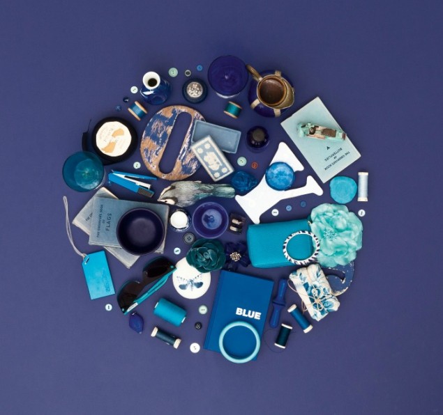
Welcome to the latest installment of Karen’s Quarterly Colour Psychology Questions in which I quiz applied colour psychology expert Karen Haller to get her take on the use of various colours in our interior design schemes. In this post we are taking a closer look at Dulux’s colour of the Year for 2013 which was the gutsy, strong and daring shade of Indigo Night. Blue has been a key fashion colour recently and has slowly filtered through into our interiors. However, indigo is not an easy hue to use and I had plenty of questions I wanted to run past Karen regarding this bold colour choice.

Earlier this year Dulux announced that Indigo Night was its colour of the year for interiors. What was your reaction to this?
What a difference to last year’s Firecracker 4. A hue Dulux described as a “blushing, lively, juicy red”. This year Dulux chose Indigo Blue as they believe 2013 is about forming ‘Connections’; how we interconnect to create networks, dialogue and conversation.
Indigo Blue was chosen as the key trend colour as Dulux felt it is a “striking statement colour associated with wisdom and honesty which enhances your environment. Like the dreamy ocean landscapes hidden from everyone but deep sea divers, this colour gives us a sense of tranquillity and stability which is very restful”.
As a paint colour, “indigo adds a surprising, elegant strength. Indigo amazes us. It instils a sense of wonder, even in adults. The fact that our access to blue this deep and rich in the natural world is limited gives it a magical quality”.
Indigo, is a blue dye that has captured the human imagination for thousands of years. This colour holds significance around the world for many indigenous cultures.
What are the main positive psychological properties of indigo?
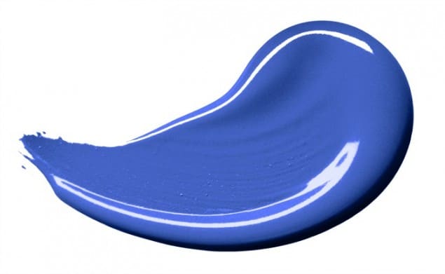
Indigo is a deep, dark, rich blue with a dash of violet. Blue is the colour of trust, honesty, friendly, logic and reason. It is the colour of the mind, affecting us mentally. Intense, dark blues stimulate clear thought.
While a true blue communicates with others, indigo leans towards the self. It represents inner contemplation and self-reflection, a colour for quiet contemplation.
How does this particular tone of blue differ from other tones?
As blue affects us mentally, the intensity of the tone affects us differently. Strong blues tones aid focused thought, whereas the lighter blue tones help calm the mind and aid restful sleep.
Lighter, softer tones of blue calm the mind and help aid concentration. These tones are serene and mentally calming.
Blue has a reputation for being a cold colour. Would you say indigo is a cold colour and if so how could we warm it up?
Blue can be perceived as a cold, unfriendly, aloof and unemotional colour as these are the negative psychologically qualities of blue. Whether you see blue as its positive or negative qualities will be up to how you are feeling and perceive the colour on any given day.
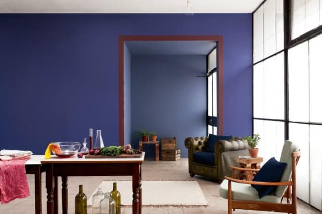
Blue is a cool colour (as is green and violet). To warm blue up look at creating a palette that includes warm colours such as yellow, orange or red.
How can we best harness the positive attributes of indigo in our interior design schemes?
If you love it, use it.
Use it in proportion and in combination with other colours to create the overall feeling you love and that expresses your personality.
If you don’t but still want to use blue then look for one of the many other blue tones available.
What other colours can be teamed with indigo and why do they work so well?
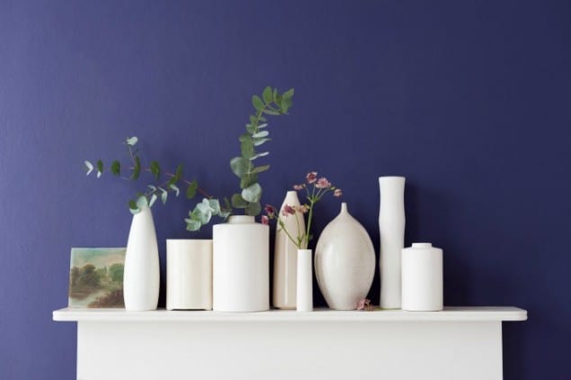
Any colour will go with indigo; it is the tone of colour you need to be careful of. So for example a clear, bright yellow based baby pink will jar with indigo, but put indigo next to a blue-based magenta and the colours will sing.
Are there any rooms in the house that particularly lend themselves to indigo? If so why?
When you walk into a room using indigo, the instant effect is wow! Before throwing it up on every wall, think about how long you can stay in that room before you feel overwhelmed.
It’s a great colour if you want to create a dramatic, bold impact. For a bathroom where you want to cocoon yourself away from the world or create a luxury feel for the second toilet. It’s a great colour for a bar, or gentlemen’s club so if you have a room where you want that style and feel then consider using indigo.
If the room is north facing, blue could make the room feel even colder.
Avoid using blue in the kitchen or dining room. As blue is the colour of the mind, it can supress the appetite.
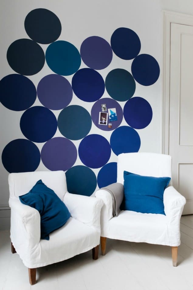
Indigo is quite a dark shade of blue and many people may be scared to commit to such a bold, deep colour choice for their home. How can indigo be used in a way that is not so daunting?
If you want to give indigo a try, then experiment. Use it in accessories such as a rug, cushions, something you can switch out or swap around.
If you want to experiment further look to use it as a detail colour, say on a chimney breast.
We never see colour in isolation so if it doesn’t feel right then play around with the colour tones, the proportions, the placement until it feels right for you.
If you want to use blue but find indigo too intense to live with, or if it just doesn’t feel right for you, there are many tones of blue to choose from such as light sky blue, midnight blue, powder blue, duck egg blue, sapphire, royal blue, cornflower blue, indigo, navy and teal, just to name a few.
For those people who are not intimidated by the use of indigo in their homes, what are some of the messages they could be sending by using it?
If you love and connect to the colour indigo, then you’ll know where you’ll want to use it in your home – where feels right. Even though it’s such a rich, luxurious colour, there is calmness, a sense of deep tranquillity and serenity about it. Select the right colours, textures and lighting to compliment and you’ll have created a truly stunning scheme.
Images courtesy of Dulux
